Verifying Natural Color in Night Sky Images
and Understanding Good Versus Bad Post Processing
by Roger N. Clark
Pervasive on the internet these days are night sky images with
unnatural color, often produced by artifacts caused by bad post processing
methodology, and often taught by professional photographers. Here is
a description of the problem, why it happens, and how to verify if your
images have the problem or show natural colors.
The Night Photography Series:
Contents
Introduction
Teaching
Unnatural Bluing of Night Sky Images
Saturating Stars Making Them White and No Color is Bad
How to Verify Natural Color
Analogies
History of the blue Milky Way at NASA Astronomy Picture of the Day (APOD)
Technical Details
Analogy
Discussion and Conclusions
References and Further Reading
All images, text and data on this site are copyrighted.
They may not be used except by written permission from Roger N. Clark.
All rights reserved.
If you find the information on this site useful,
please support Clarkvision and make a donation (link below).
Introduction
From the first part of the series (3a, 3b, 3c), I have shown how we know,
with good precision, the color of stars, nebulae, aurora, and other
objects in the night sky. Unfortunately, it appears that in the digital
photography era, some photographers have been teaching methodologies that
produce images with unnatural colors and even varying color balance with
scene intensity. The technical reason is they do not seem to know the
basics of image processing, when one should subtract and when one should
multiply, and/or they don't understand the tools they are teaching with
and whether or not those tools are doing a multiply or add/subtract.
This is quite unfortunate as better methods are easily applied to night
sky images that not only produce natural color, it brings out amazing
and beautiful colors in the night sky. In this article, I'll show and describe
why this problem happens, and how to check your own images to verify
color in your night sky images.
A natural color image of the Milky Way galactic core region is shown in
Figure 1. The brownish-red color is from cool (orange and red) stars
and reddish-brown interstellar dust. As one moves out of the plane of
the galaxy (left and right from the bright Milky Way in Figure 1) the
color does not change to the commonly seen blue in Milky Way images seen
on the internet. In fact, the color actually gets slightly redder.
We know this from stellar photometry. The blue seen in in Milky Way
images online are artifacts created in post processing--fake colors.
Figure 1. Bandon Oregon Nightscape in natural color.
The colors were kept natural by properly using the curves tool in a photo editor
to bring out faint details and subtract light pollution and sky glow.
The light on the rocks is from the city of Bandon.
Larger gallery image with more info is here.
If you do a google search for how to make night sky images, you will likely
come across many sites teaching how to make images like those in Figure 2a middle and right
panels. I will hit hard in this article, because many of the photographers
teaching these bad methods have done so for so long and produced so many
blue images they do not want to acknowledge that their images are producing blue
artifacts and unnatural color and even become hostile in discussions about color.
Further, such teachings have become so common that many people think the natural
color of the dark, moonless night sky, including the Milky Way is naturally blue.
The Milky Way IS NOT BLUE in natural color.
Photographers are certainly allowed to color their images any way they want for effect, even when
it is not natural. I have no problem if those teaching sites would simply
acknowledge they are producing such colors for a particular effect
(e.g. mood) and acknowledge what natural colors exist in the night sky.
But too many are insisting their images are natural. Further, some
even insist the colors in images like I produce, which are verified
by color photometry and spectral intensities, are the ones that are not natural.
If you come across such sites, I recommend you steer clear.
I am hoping my series on natural color in the night sky will change such
attitudes and when they do, I'll change this article.
Again, it is fine for photographers to color their images any way they wish
for mood. But if the site does not discuss that the colors they produce
are simply for a mood and not natural color, the author may not know
what they are doing and actually believe they are producing natural color.
Indeed, I encounter many sites like this. If you see such sites, please
email the author and tell them. Be aware you might get a hostile response.
I also want to acknowledge that photographers and astronomers also make images
that are purposely not natural color, including infrared, ultraviolet,
and narrow band tuned to specific emission lines. Such images are
called false color and can also be beautiful. In my professional
astronomical work, most of my images use infrared. Such images
are acknowledged for their specific applications and not passed
as natural color. This article is about producing natural color
images of the night sky and avoiding artifacts from processing that make
images depart from natural color.
You can see examples of my scientific work using false color and
narrow band IR in the
Science section of this web site and in my
Scientific Publications.
Teaching
There are many web sites teaching unnatural color night sky processing and
conduct photo workshops and tours, teaching unnatural color. They argue
that one can't see color at night, so we can color our images any way
we want. Well, yes, everyone can color their images any way they want.
But you can actually see color in the night sky.
Next time you are out under a dark night sky get dark adapted by using
no lights for at least a half hour. Part way in to dark adaption, you
should see that some stars are red. Planets show color, like Mars is red,
Saturn and Jupiter yellow. Bright stars like Antares are red-orange.
Other stars appear yellow, white and a few blue-white. Use a pair of binoculars
to make the stars out of focus and see how many colors you can see.
A disk is easier to see the color than a point.
If you are far from city lights in a dark sky and the galactic center is up
(summer in the northern hemisphere), the galactic core appears yellow-brown
to people with normal eyesight. The Milky Way was named for the color of milk
many centuries ago. But milk back then was not the white pasteurized product we
buy at the store today--it was typically yellow, not white.
Use a small amateur telescope and more stars will show color. Brighter
nebulae will also show color: pinks, greens and blues. Larger telescopes
will show more objects in the night sky with color. Our eyes evolved
with sunlight, and when relaxed and not biased by strong colors, we see a
daylight white balanced world. Our color perceptions get skewed by the
use of artificial lights, like tungsten, orange sodium street lights,
and bright red flashlights.
Next time you go out at night, take a MacBeth color chart. How many colors
can you see at night? (See Figure 3.)
There are many types of photography that the camera shows things that the
eye can't see, including fast action, very slow, to high magnification
macro. What if a new fad started where every fast action scene needed
to have butterflies added, and it got to the point that if someone posted
an image, or entered one in a contest, that did not have butterflies added,
the image was scored low and even called unnatural? Example: an image
of a speeding bullet with a butterfly sitting on it? You can't see the
bullet, so how do we know the butterfly isn't there people would say.
(Quite ironic in this age of alternative facts.)
We are in this situation with night sky photography. People enter a
natural color night sky image in a contest and the judge says the colors
are wrong. I have seen this happen multiple times. I have seen judges
say aurora images have the color wrong because the aurora was natural
color and not cyan.
(The green auroral color is from oxygen emitting at 557.7 nm which is yellow-green, not cyan-green.)
So, bottom line, I firmly believe photographers can color their images any
way they want, but if they are teaching (including a web site tutorial),
they should tell people what the natural colors are and how to process
for natural color as well as their interpreted color.
Unnatural Bluing of Night Sky Images
The problem of natural color in night sky images comes down to basic multiplication
and addition. Whatever tools we use for post processing images, they apply a modification of the scene
intensities by multiplication and/or addition/subtraction. Color balance is a multiplication,
but the light from the night sky has multiple added components:
- Components Contributing to Night Sky Images by Addition:
- 1) Light from stars, nebulae, planets, comets and galaxies and other natural objects beyond our atmosphere.
- 2) Light from the glowing atmosphere (airglow) and aurora.
- 3) Light from man-made satellites and airplanes passing overhead.
- 4) Light scattered off of particles in the atmosphere from artificial illumination (light
pollution from cities).
- The above components are Multiplied by:
- 5) Absorption of light through the atmosphere. absorption increases toward the horizon, causing a
yellowing and reddening of stars and other objects beyond the Earth. This is
the same effect that makes our sun appear yellower/redder near sunrise and sunset.
It can also redden light pollution from distant cities.
The signal our cameras record is the ADDITION of the above 1 -
4 components and MULTIPLIED by component 5. If you want to produce
an image of the night sky that has only component 1 or components 1 and
2, then components 2 and 4 (or 2, 3, and 4) MUST BE SUBTRACTED.
Many sites teach a bad methodology of using white balance, which is a
multiply, not a subtraction to remove/reduce the effects of components 2
and 4. Part 3 of this series teaches better post processing methodology
and subtraction of light pollution. This article is focused on the
detrimental effects being widely taught, how to recognize it, and how
to verify natural color in your night sky images.
The basic problem of producing night sky images with natural color
is a bluing that is caused by post processing by multiplication (color
balance) to reduce effects of light pollution when a subtraction should
be done. The bluing created by this process also enhances noise because
there is little blue light in the dark, moonless night sky away from cities.
Trying for force blue in a scene with little blue light enhances noise.
Figure 2a. Different post processing methods leads to different colors.
The left panel shows natural colors verified by star photometry. The
middle panel shows color balance shifting with scene intensity causing
an unnatural bluing as scene intensity decreases. The right panel used
a tungsten white balance which made the image very blue to start, then
methodology like that in the middle panel to further shift faint parts
of the image even bluer. The middle and right panes are unnatural colors.
The images in the 3 panels were made from the same raw file, a 30 second exposure
made with an f/2.8 lens in moderate light pollution.
Figure 2b. Example image processing with similar effects as in the
night sky processing in Figure 2a. Left: natural color.
Middle: blackpoint error causing bluing of darker portions
of the scene. Right: Tungsten white balance plus the black
point error as in the middle panel.
Science or just good color practices? I have been accused
of pushing scientific accuracy in night sky photos. I have made the
distinction between natural color versus true color. A true color image
of the night sky could be considered accurate color calibration with no
contrast or saturation adjustments. Natural color opens the door for
contrast and saturation adjustments, but keeps the basic colors as would
be seen if the objects were bright enough to stimulate color response
in our eyes. This also assumes normal vision and not color blindness.
Red colors are kept reddish and not changed to blue or some other far-off
color. Similarly for yellows, greens, blues and all other colors.
I am not quibbling about the exact shade or hue, only that it is not
wildly off as in the middle and right panels in Figures 2a and 2b.
Figure 2b illustrates basic natural color of skin tones in a portrait
versus bad image processing of similar magnitudes used by night sky
photographers to color their Milky Way blue. If you make a portrait of
a person, you do not need a rigorous scientific method for reasonably
accurate skin tones. Most people would never produce images like those
in Figure 2b middle and right panels, and they are obviously too blue
for most people's tastes. Just a basic color setting was needed (white
balance) to get skin tones reasonably natural. How close the skin tones
appear to you depends on your monitor and its color calibration versus my
color calibration (I use a color-calibrated monitor using an independent
calibration measurement tool). For reasonably accurate color that most
people recognize as close (especially if they know the person), I would
call this natural color. Digital cameras make good natural color images
with basic settings that photographers can easily choose in camera or
in post processing of raw data.
Good natural color in night sky images is also relatively easy to
achieve, but is a little more complex because of light pollution and airglow.
Making images of the night sky overhead is like making landscape images on a foggy day
with the scene about 8 kilometers (5 miles) away. At 30 degrees
above the horizon that equivalent foggy distance increases to about 16 km (10 miles),
and even more lower down. You get the fog out of the image
by subtracting the light scattered by the fog. And the amount subtracted
changes with height in the scene. (Technical note: the 8 km distance comes
from the scale height of the atmosphere, I rounded it from the 8.5 km for the
Earth's scale height.)
Using white balance to "correct" light pollution or reduce airglow is the
wrong method and results in changing color balance with scene intensity.
Light pollution and airglow are added light (the fog discussed above), so should be subtracted.
White balance is a multiply: multiply the intensities in the red,
green and blue channels using different factors to change which colors
are brightest. But white balance corrections for light pollution and
airglow do not produce a neutral balance--it just changes the color of the light
pollution and the night sky beyond. It produces a bluing/purpling
of the scene as intensities become lower as typically implemented
(Figure 2a, middle and right panels). (The technical reason is because this
introduces a black point error.) The key
things in such images are the outer portions of the Milky way turn blue in
images where white balance is used to "correct" light pollution. Depending
on the severity of the light pollution, the white balance correction can
result in blue to purple colors in the fainter parts of the Milky Way.
Light pollution sometimes decreases with height above the horizon,
so correcting light pollution with white balance can also cause a
bluing/purpling of the night sky with height in the scene
(Figure 2a, middle and right panels). All this is
easily avoidable with better post processing methods.
We learned in
Part 2b) The Color of Stars
that the majority of stars in the Milky Way are stars similar to our sun and
cooler, thus redder. Around the galactic center, there are many yellow,
orange and red stars and as the Milky Way fades into the sky background
the color of stars remains similar and certainly does not change to blue.
Also, the dark moonless night sky without light pollution is not blue;
it is commonly filled with red and green airglow (sometimes yellow and
orange airglow).
One can see many star colors with the unaided eye, more with binoculars,
and more with a telescope, but not the colors seen in night sky images
where color balance was used to correct light pollution.
Note that fewer than 1% of the stars in the night sky are blue. The vast
majority are similar in color to our sun and redder. Most of the nebulae
in the night sky contain hydrogen so in natural color are magenta to
pink (not red), and the vast dust clouds are reddish-brown. Only a few
nebulae are blue from dust smaller than the wavelength of light (from
Rayleigh scattering-the dust around the Pleiades cluster is an example).
Airglow is dominantly red and chartreuse green, only rarely blue. Thus
the dominant colors in the night sky is beyond Earth's atmosphere is
anything but blue. More information on this is found in parts
2a) The Color of the Night Sky,
2b) The Color of Stars and
March 2c) The Color of Nebulae and Interstellar Dust in the Night Sky
Indeed, if we image a MacBeth color chart (Figure 3) that is illuminated
by only light from the dark, moonless night sky away from cities, the
color chart should have similar colors as illuminated by our daytime sun.
(Part 2e of this series shows the colors on the chart using the daytime
sun.) There are more yellow and orange stars than solar type stars in the
night sky, so the colors will be slightly different with blues appearing
a little darker. Indeed that is what is shown in Figure 3, and what I
observed with my unaided eyes. Yes, those colors were visible to me.
Relaxed with no artificial lights, our eyes have a daylight white balance.
The colors in the chart in Figure 3 were close to what I observed.
The darker colors, especially the dark blues appeared gray to me.
The green appeared a gray green. The other colors were pastel versions of
the colors in the chart. Even the dark brown in the upper left corner was
visible as a brownish-gray. Note, the image and the visual observations
of the chart were made around midnight on March 22, 2017 from the central
Colorado, USA, Rocky Mountains at 10,000 feet elevation, so the brighter
summer Milky way was not in the sky, only the fainter winter Milky Way,
which was low in the western sky, and mostly blocked by trees. With the
brighter summer Milky Way, the colors should be more prominent. Try it
yourself. People with normal color vision can see colors at night.
I also found that holding the color chart up helped add references,
enabling me to distinguish more colors in stars.
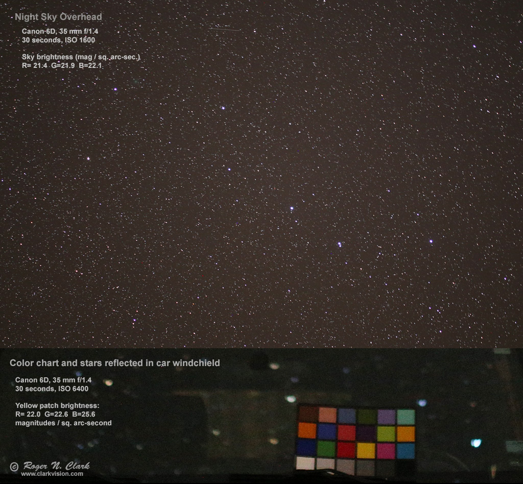
Figure 3. Image of a MacBeth color chart sitting on a car windshield and illuminated only by
the night sky (example image of the overhead night sky). Color balance is daylight.
Saturating Stars Making Them White and No Color is Bad
Would you make a daytime landscape image with beautiful clouds, but
block the clouds up to all white with no color or tonality? That is a
mark of a bad landscape photo. So why do some professional and serious
amateur photographers process night sky images to block up stars to
make them mostly white (usually on a blue background)? Figure 4 shows
differences in processing: left blocked up all white stars on a blue background,
versus on the right, processing to maintain reasonable star colors.
Stars do have color!
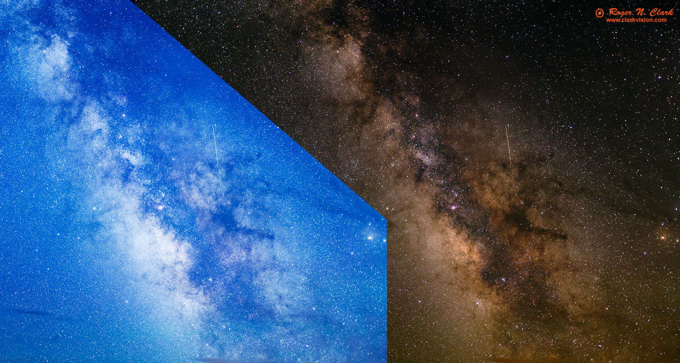
Figure 4. Comparison: processing to make a blue sky (left), with all white stars,
or natural colors of the night sky with many star colors and nice tonality (right).
How to Verify Natural Color
The first step is to get a planetarium program that tells the color of stars.
I recommend
Stellarium (free, open source software). The color of stars was shown in
Part 2b (The Color of Stars)
to be well characterized by the B-V magnitude index. Extracts of Table 1 from Part 2b
is shown below as Table 1 here which lists the colors with different B-V indices.
The colors listed in Table 1 are the colors people with normal vision
will see visually when properly dark adapted and observing the night sky with
unaided eyes, binoculars and/or telescopes. Fewer than 1% of the stars in
the night sky are blue; most are yellow to red. If you start Stellarium
and click on a star, data on the star is shown, including the B-V index
(Figure 5, left panel). Then look up the color by comparing the B-V
value from Stellarium (or other star program) with the values in Table 1.
The descriptive color from Table 1 should be close to what you observe
in your images if they have natural color.
Thus, verification of natural color is a simple matter of identifying
stars in your image that are not saturated, and identifying those stars
in stellarium and checking the color. Figure 5 shows the central part
of the images in Figure 2a. The white arrow points to the same star in
Stellarium, and the corresponding star in the 3 images from Figure 2a.
The B-V of the star is 0.38. Looking at Table 1, we see that a B-V
between 0.3 and 0.4 should be white to slightly yellow-white in the
image if the image has natural color. Indeed, the panel in Figure
5 shows the star looks white (as white stars decreases in intensity,
they will appear gray on the image). But the right two panels in Figure
5 show the star as blue, which is not the natural color of the star.
You can check as many stars as you like, but check different intensities
to be sure color balance is consistent with scene intensity.
              Table 1

     Color of Stars and B-V Index

    B-V Index    Color

 less than -0.4  Very Blue
     -0.4        Blue
     -0.3        Deep Blue-White
     -0.2
     -0.1
      0.0        Blue-White
      0.1
      0.2
      0.3        White
      0.4        Pale Yellow-White
      0.5
      0.6        Yellowish-White   Our Sun has B-V = 0.656
      0.7
      0.8        Pale Yellow-orange
      0.9
      1.0
      1.1
      1.2
      1.3
      1.4        Light Orange-Red
 1.5 and higher: Redder
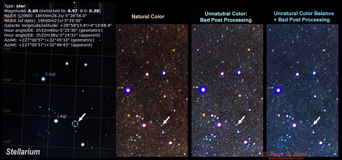
Figure 5. Checking for natural color is as simple as looking up the
B-V value of the star in a program like Stellarium (left panel) and
comparing the B-V to the expected color from Table 1 with the color in
your image (right 3 panels). In this example, the natural color panel
show a star color consistent with the B-V value. The right two panels
show the star is too blue and not natural color. The blue color is an
artifact of poor post processing methods.
The star B-V value of +0.38 indicates a slightly yellow-red side of white. The
Natural Color panel has color of red=181, green=177, blue=174, thus all within
4% and slightly on the yellow-red side, as expected.
The 3rd panel from the left, labeled Unnatural Color, has red=195, green=230, blue=252,
thus blue is brighter than red by 29%, so distinctly blue and not the color indicated by
star photometry. The right panel has red=157, green=195, blue=232 so blue
is brighter than red by 48%, thus quite blue and far off from stellar photometry.
History of the blue Milky Way at NASA Astronomy Picture of the Day (APOD)
Images on the
NASA Astronomy Picture of the Day (APOD) web site, shows that the
trend of blue Milky Way images started around 2007 to 2009.
Summary if you do not want to look at each image below, compare:
2005 October 4 The Milky Way in Stars and Dust to
2009 July 29 The Milky Way Over Devils Tower Wally Pacholka (TWAN)
December 12, 1996 The Milky Way Through the Summer Triangle
Film image, shows tan Milky Way in Cygnus.
July 23, 1996 Hale-Bopp, Jupiter, and the Milky Way
North of the galactic center. Film image shows
the Milky Way as yellow-brown.
June 5, 1996 Sagittarius and the Central Milky Way
Film image. Galactic core is yellow and lots of orange
dust.
August 17, 1998 Comet Hyakutake and the Milky Way
Reddish Milky Way and reddish airglow.
November 26, 1998 Meteor Milky Way
Film image of Orion region showing grayish
airglow and red h-alpha nebulosity.
2001 June 27 Moonlight, Mars, and Milky Way
The first bluish night sky Milky Way image on APOD,
but it is blue due to moonlight and maybe twilight.
2002 September 23 The Milky Way Over the French Alps
Film image but digital enhanced--the first Milky Way
image stated as digitally enhances. The galactic core is
yellow-white and color fades without shift to the background sky, but
the background sky is dark blue. Antares is yellow.
2005 October 4 The Milky Way in Stars and Dust
Yellow-white galactic core with orange dust.
No color shift from galactic plane to outer portions of the
Milky Way. Background sky is black.
2006 August 1 The Milky Way over Utah
The first digitally enhanced image with the color shift
away from the galactic plane. The galactic core dull white,
M20 white. Only the brightest dust is brown-orange.
2007 January 23 The Milky Way Over Paranal
Milky Way core is yellow with lots of brown-orange dust.
No color shift to the background away from the galactic plane.
Background sky is green airglow.
2007 May 25 Jupiter, Vesta, and the Milky Way
Galactic core is yellow. Little color shift away from
the galactic plane. Background sky is green airglow.
Antares is yellow.
2007 October 20 The Milky Road
The first APOD with strong color gradient in the Milky Way
away from the galactic plane. Galactic core in yellow-white.
Strong color gradient from blue horizon up to black. APOD
caption calls it a "fantasy view."
2008 January 4 The Milky Way at 5000 Meters
Galactic core is yellow. Lots of orange dust.
Antares is orange. Small color gradient away from the
galactic center toward blue. Background sky is black.
2008 May 3 Alborz Mountain Milky Way
The first really blue Milky Way image on APOD. Galactic core
is off-white, Antares yellow. M20 white. Brightest dust is brown,
but all fainter parts of the Milky Way and stars are blue.
2009 January 27 The Milky Way Over Mauna Kea
Yellow galactic core, bright brown dust and the Milky
Way color shifts to blue away from the galactic plane.
COMPARE with:
APOD 2005 October 4
2009 February 19 Mauna Kea Milky Way Panorama (TWAN)
Strong color gradients to blue.
Yellow galactic core, bright brown dust and the Milky
Way color shifts to blue away from the galactic plane.
2009 May 19 Sagittarius and the Central Milky Way
Rust orange dust, no color gradients.
Excellent processing by Robert Gendler.
2009 June 13 The Milky Road
Strong color gradients to blue.
Yellow galactic core, bright brown dust and the Milky
Way color shifts to blue away from the galactic plane.
2009 July 29 The Milky Way Over Devils Tower Wally Pacholka (TWAN)
Strong color gradients to blue.
Off-white galactic core, some brown dust and the Milky
Way color shifts to blue away from the galactic plane.
2009 August 18 The Milky Way Over the Badlands Wally Pacholka (AstroPics.com, TWAN)
Strong color gradients to blue.
Off-white galactic core, some brown dust and the Milky
Way color shifts to blue away from the galactic plane.
Technical Details
In this section, I will give some more technical details. Figure 6 shows the
image used to produce the images in Figures 2a and 3, but before any light pollution
was removed. The orange cast is due to light pollution from a nearby city.
The white line is a traverse of image intensities shown in Figure 7.
Figure 6. Image from Figures 2a, 4 before light pollution was removed. The white line
is the traverse track and the intensities along the track are shown in Figure 7.
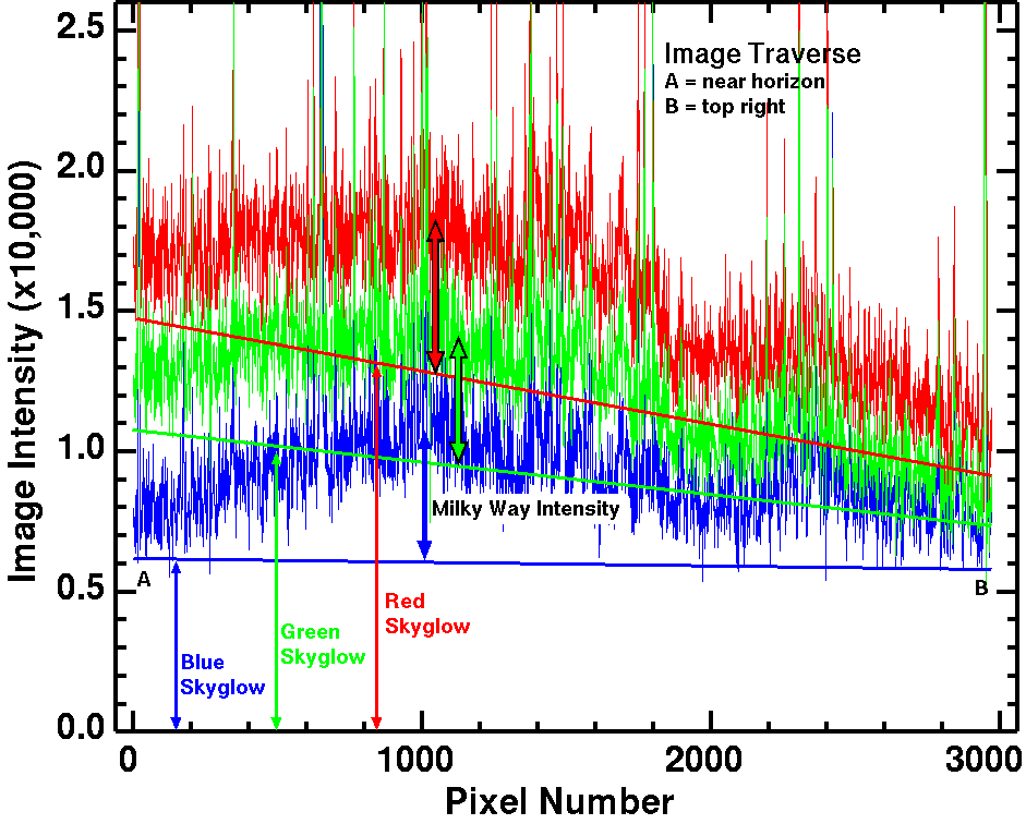
Figure 7. Traverse of scene intensities along the track shown in Figure
6, from point A near the horizon, to point B at upper right in the image.
The straight lines show approximations of the light pollution gradient
in the image, and the intensity and amount of the gradient is different
for each color. The skyglow intensities need to be subtracted in order
to show the stars and Milky Way in natural color.
The straight lines represent the blackpoint in the image. Note the blackpoint
is different for each color channel and for each pixel in the image.
The upward spikes are
stars. Much of the up and down structure in the traverse is structure
in the night sky and Milky Way, while some is also noise from the low
light levels. The vertical scale is a 16-bit range, 0 to 65535, and the
sky histogram peak on the camera LCD was at about 20% from the left to right.
That means the sky data are in the linear regime of the characteristic
tone curve (see Part 3b for information on this topic).
The intensity profiles in Figure 7 illustrate the magnitude of the night
sky imaging problem with relatively low light pollution. Note the solid
lines labeled Blue Skyglow, Green Skyglow and Red Skyglow. The distance
from zero shows approximately how much needs to be subtracted to reduce
the light pollution to show the Milky Way and stars in the night sky in
natural color. That large offset reduces the contrast in the deep sky.
That contrast reduction is also why it is harder to see the stars in a
light polluted sky: the added lighted reduces contrast below what our
eyes can detect. It is the same with the daytime sky: the stars are
still there in their same intensity, but the sunlight scattered off of
molecules and dust in the sky is so bright that the contrast is too low
to see the stars.
By subtracting the light pollution, we can then amplify the remaining small signal
from the stars and Milky Way to make beautiful images in natural color.
If we multiplied the signals in Figure 6 and 7 (e.g. by applying color balance
to make the image less orange), the light pollution is still
there, just with a different color and mix, producing the unnatural bluing with
different scene intensities. White balance is a multiply, so is the incorrect
method to reduce the effects of light pollution. This also includes
auto-white balance and other forms of histogram equalization.
Analogy
Let's try this analogy. Two people, Anthony is 5 feet tall, and Bob is 6 feet tall.
Anthony stands on a chair that is 4 feet high. Bob stands on a chair that is 2
feet high. There is an empty 4-foot high chair beside Anthony, and an empty
2-foot high chair beside Bob. So you can measure the height of the empty chairs and
the chairs with people on them. Now determine how tall each person is.
So we have:
Anthony + 4 foot chair = 9 feet.
Bob + 2 foot chair = 8 feet.
The analogy is the empty chairs are the light pollution, and the people
on the chairs are the stars, nebulae, and galaxies in the night sky.
By the method used above, a multiply to equalize the chair heights,
we could derive multipliers like 1.0 for Anthony and 0.5 for Bob.
This way the chairs have the same normalized heights: 2 feet. (This what
people do with night sky images: they make the red, green, and blue channels
line up producing a grayer/bluer sky background by multiplying the intensities
of each color channel.
This is called histogram equalization.
Back to the analogy.
Now we multiply the measured heights of people on the chairs times our normalization
factors:
- (Anthony on chair = 9 feet) * 1.0 = 9 feet,
- (Bob on chair = 8 feet) * 0.5 = 4 feet.
So we erroneously conclude the two chairs have the same height, then
Anthony is 9 feet tall and Bob is 4 feet tall! Obviously, a multiply is
the wrong method, which results from the ASSUMPTION that the two chairs
are of equal height (the analogy to make grey/blue sky from light
pollution using histogram equalization).
But a subtraction of the chair is simple:
- Anthony on chair - 4 feet = 5 feet,
- Bob on chair - 2 feet = 6 feet,
the correct heights of Anthony and Bob.
So too with light pollution. It is added light, so subtract it. If you
multiply, you get the wrong answer with detrimental effects.
Daytime Photographic Analogies
Here are three analogies, Figures 8a, 8b, and 8c. Each one is an image
where the colors have been radically changed to something quite unnatural
in post processing. Certainly these images create a different mood.
I believe that photographers are certainly OK with creating any color
scheme they want, just realize when it is natural and when it is a
digital creation.
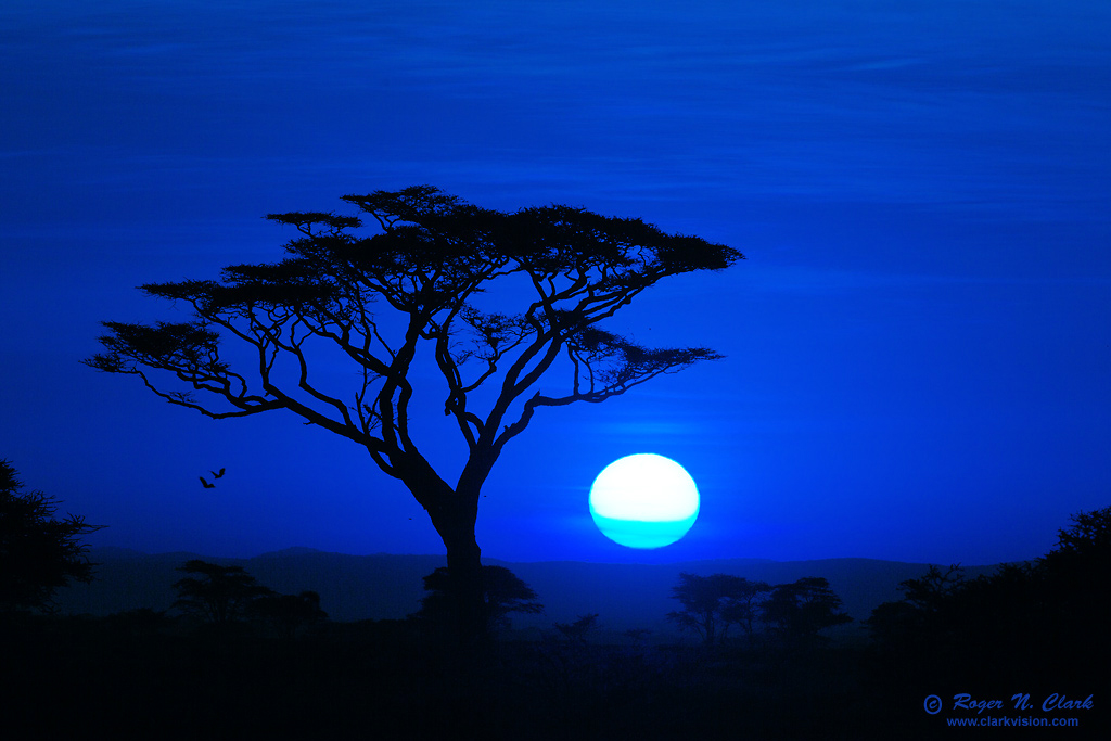
Figure 8a. A beautiful red sunrise has been turned blue with post
processing. This is similar to
the turning of naturally red night sky images blue.
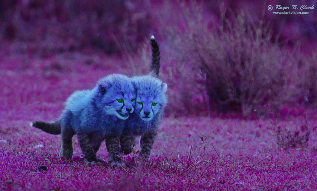
Figure 8b. Artificially blue night sky images? Why not blue baby cheetahs?
Easy in post processing.
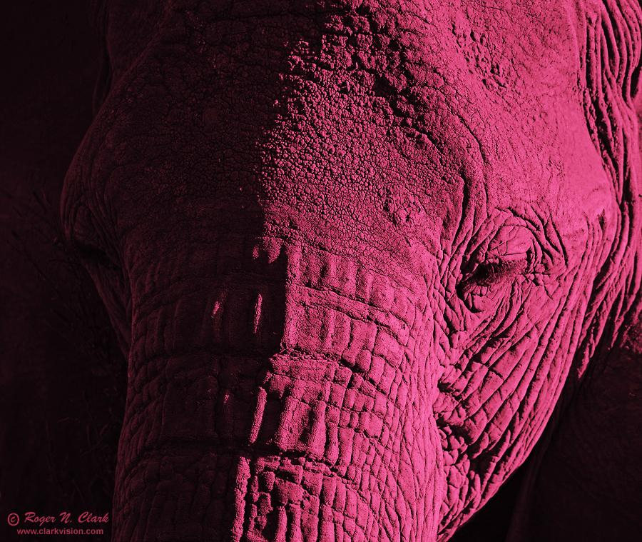
Figure 8c. Hear of pink elephants? Easy, just make fake colors in post processing.
Discussion and Conclusions
Photographers are certainly allowed to color their images any way they
want for effect, even when it is not natural. If it were a sunset scene
and the reds were turned green or blue, people would likely understand it was
not real. But many are not familiar with colors in the night sky and
when they process their images are unaware of the artifacts producing
the bluing.
If you want natural color in your Milky Way and night sky images, DO NOT
USE white balance, including auto-white balance to reduce light pollution. It does not
reduce light pollution--it just changes the color.
The Milky Way on a dark moonless night away from cities is NOT
naturally blue. The Milky Way is full of beautiful colors, including red
and pink emission nebulae, reddish-brown dust, mostly white to yellow
and red stars, sprinkled with occasional blue stars, blue reflection
nebulae, and green (due to oxygen) emission nebulae. If you use white
balance to reduce light pollution, you'll turn too much of the image
blue, hiding and suppressing the natural beauty of the night sky.
For natural color, record night sky images with daylight white balance
and use tools that subtract light pollution. I describe appropriate
methods in the following parts of this series.
Blue Milky Way images have become truthiness and an artifact in the
digital camera age by people pushing a process that is destroying
color. I'm fine with people coloring their images any way they want,
but I object if they insist a blue Milky Way is natural, and I really
object when they say my non-blue Milky Way images are wrong because they
are not blue (yes, I get this often).
I strive for a good representation of natural colors, and use a
color-managed workflow on a color-calibrated monitor. For example, pick
a typical daytime scene or red sunset scene and process it the same as
you do astro images. The typical astro processing that is popular these
days includes histogram equalization. That is disastrous to proper color
balance. Try it on a red sunset scene. I have. See Figures 10a, 10b,
10c here:
3c) Astrophotography Image Processing with Light Pollution .
Note how the histogram equalization has turned red to blue! That is
the source of a lot of blue in astrophotos--not natural at all.
Processing that includes histogram equalization is a main reason for
poor hydrogen-alpha response in digital camera images (hydrogen-alpha is
the emission that makes some nebulae red). Most cameras actually have
reasonable hydrogen-alpha response, and if people used a normal color
managed work flow similar to any other image, the true natural colors will
come out, including plenty of hydrogen-alpha. Start with daylight white balance.
If you find the information on this site useful,
please support Clarkvision and make a donation (link below).
References and Further Reading
Clarkvision.com Nightscapes Gallery.
Jacoby, G. H., Hunter, D. A., and Christian, C. A., L Library of Stellar Spectra,
The Astrophysical Journal Supplement Series, 56, p. 257-281, 1984.
Spectra with corrections through May 2014.
Article and data can be found here (for digital data follow the SIMBAD Objects link).
The Night Photography Series:
http://www.clarkvision.com/articles/color-of-stars
First Published December 26, 2015
Last updated March 6, 2019