ClarkVision.com
| Home | Galleries | Articles | Reviews | Best Gear | Science | New | About | Contact |
Calibrating Your Monitor and Color Management
by Roger N. Clark
| Home | Galleries | Articles | Reviews | Best Gear | Science | New | About | Contact |
by Roger N. Clark
Contents
Introduction
A workflow that produces images with the colors as you intend them, requires a calibrated monitor and correct setup of the computer system. Even if you have calibrated your monitor, how do you know it is correct? I ask this because I calibrated my monitors and after calibration, I found the calibration was not correct. As a result, I was getting inconsistent results and images changed colors when I prepared images for the web (the colors should not change) and for print (prints being reflective medium and pigments that absorb colors will never be identical to a computer monitor because monitors use additive colors). Further, if you see significant color shifts when you process images in your image editor, for example when converting from one color space to another, your system is not set up correctly.
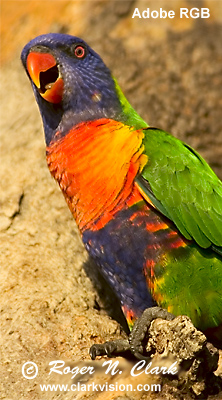
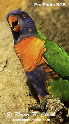
Is your system set correctly to view images? The following 3 images in Figure 1a of a lorikeet should all look the same. If they do not, your system needs tuning, and/or you need to use a different web browser or you need to turn on color management in the browser. And even if they do look the same, everything may still not be set correctly. Most web browsers these days do color management. For comparison, examine the images in Figure 1b, which are have no embedded color tags. The Adobe RGB image should look a little different from the sRGB image, but the Pro Photo RGB image should show show a large difference. If the images in Figure 1a look like those in Figure 1b, and the Pro Photo RGB looks significantly different that the sRGB, then you are not viewing witha color managed browser with color management enabled.


The purpose of this article is to check and diagnose if your color management settings are correct and that the important photo viewing (and editing) programs are operating correctly. It is not the intention of this page to say you need to surf the web in a color managed web browser. Further, it is not adequate to just purchase a monitor calibration device, install the software and "calibrate" your monitor. The calibration may not have gone correctly, or there may be competing software on the system that messes up the color management.
Save each of the images in Figure 1a on your computer (You have my permission for non-commercial use and not for posting on any web sites or published in any form; All Rights reserved). Now open the 3 images in your photo editor (e.g. photoshop, gimp, or other). Do all three images look the same in your photo editor? Do the images in the web browser AND your photo editor look the same? If not, then your system is not set up correctly, is incorrectly calibrated, or both.
But why manage color? The default color space for the Web, many computers and many ink-jet printers is sRGB. The sRGB color space was defined in 1996 by Hewlett Packard and Microsoft for use on printers, CRT monitors, and the internet. But the sRGB color space is a small fraction of the colors (the gamut) that can be seen with the human eye. Figure 1 shows the sRGB gamut compared to that of the eye.

So, because of the limitations of the sRGB color space, it is desirable to work in a space that shows more of the colors that we can see.
Our eyes have unusual properties for detecting different colors of light. It is difficult in practice to make devices, whether computer monitors, or printers that can reproduce the full range of colors that can be seen by people. Further, depending on the light source, colors can appear different. For example, viewing an image by low wattage incandescent light versus in sunlight, versus fluorescent light changes our perception of color. We view images on a monitor where colors are created by additive colors, but on a print, the colors are created by absorption by the pigments, so are subtractive. Color management tries to preserve a wide color gamut while equalizing (to a degree) the perceived colors on various output devices. While it is not possible to completely equalize all devices, color management mitigates the differences, enabling more consistent colors, whether viewing on a computer monitor, or on a print.
Background
Background for people new to color management,
read these excellent articles by Gary G. Ballard on color management.
You can also download images to test your color managed workflow, although the above
3 images will also work well:
http://www.gballard.net/psd/go_live_page_profile/embeddedJPEGprofiles.html
also: CS5 Photoshop Basic Color Theory: http://www.gballard.net/psd/cmstheory.html
Other reference images by Gary: http://www.gballard.net/photoshop/pdi_download/
My Calibration
Let me first describe my color settings and workflow.
For many years I used Windows XP for my photo processing system, with Photoshop and ImagesPlus for image processing. For some special projects I write my own software, usually using Davinci (from davinci.asu.edu).
In 2010 I changed from XP to Ubuntu Linux, and in 2013 to Linux Mint (with the Mate interface) but I still need to run Photoshop and ImagesPlus, so I installed VirtualBox and run Windows 7 as a guest operating system under Linux. This allows me to run Photoshop and ImagesPlus but have the tools I need and want in linux. (Linux has evolved in the last few years to a spectacular desktop operating system that is as usable as other alternatives for everyone, even those who have not used computers much.) But the basic settings in photoshop, and calibration procedures I outline below are the same regardless of operating system.
Calibration is done by using a device that measures the light output from your computer monitor.
I calibrate with a Spyder 3 and calibrate my monitor to gamma 2.2, white point= 6500 K (using Argyll in linux). The gamma describes the logarithmic relationship of input signal (your image data in the computer) to screen brightness. It is very important that you choose a white point as well as a gamma. For presentation on the web, most people viewing images will be using a gamma near 2.2. The 6500 K refers to a color temperature, and 6500 K is the approximate color temperature of the sun inside out atmosphere near sea level. Technically, the specification for solar response includes all the absorption and emission lines in the solar spectrum, so is not quite a 6500 K Black Body; that specification is called D65.
Whatever calibration software you run (e.g. calibration tools, like the Spyder 3, usually come with software from the manufacturer for at least windows and Mac OS), after calibration be sure the calibration is turned on. On windows, this will most likely be done in the software that came with the calibration hardware. See below for how to apply icc profiles in linux. ( Specific commands to do the calibration in Linux are given at the end of this article.)
I record raw data from my camera. In raw conversion I output a 16-bit tif Abobe RGB image (e.g. with Adobe Camera Raw, ACR).
In photoshop, open the image and photoshop recognizes the Adobe RGB color space. This is the source color space (the color space of the image).
But what are the correct settings in photoshop? It seems that one should
be using the monitor profile and using:
view -> proof setup -> monitor RGB
and
view -> proof colors (checked).
The above settings are what is recommended in Frazer, Murphy, and Bunting, Real World Color Management, 2nd edition, 2005. On page 217, it says to choose proof setup: Monitor RGB. BUT THIS IS WRONG
It seems that monitor RGB should set up photoshop to use the monitor profile correctly. But what if the operating system is already managing the colors with the monitor ICC profile? Monitor RGB with proof setup checked will display the image as it would appear if the RGB values in the image file were simply sent to the monitor with no color management.
For example, load the three lorikeet images above in your photo editor, and also load them into firefox (or other color managed browser). On a correctly configured system, the six images (3 in the image editor, and 3 in the web browser) should look virtually identical in color managed programs like photoshop and firefox. Do they for you? Be sure view -> proof setup is unchecked.
Additional checks can be found on this web page:
http://www.gballard.net/psd/go_live_page_profile/embeddedJPEGprofiles.html
The first image on the upper left is adobe RGB and when you mouse over it, it is sRGB. In firefox on my linux machine, the two images appear pretty identical, as they are supposed to. Note they should appear identical whether or not your system is calibrated. This is also independent of whether or not the colors are accurate on your monitor, and assumes the gamut of your monitor is adequate to render the colors in the image correctly.
In first setting up my system, I did not have COMPLETE consistency. I could see consistency in programs like firefox, but not photoshop, or complete color consistency in one program, but not between programs. But how does one know which version is correct? Both the sRGB image and and Adobe RGB image look good, but different. The key is the Pro Photo RGB image. In my case, it turned out the sRGB image was the correct one, and the Adobe RGB and Pro Photo RGB images had more muted or bland colors.
The key was loading 3 images: the sRGB, Adobe RGB and Pro Photo RGB images.
I loaded all of them into photoshop, into firefox, and into the windows 7
image and fax viewer, which are all color managed. All three
images in all the color managed programs should show the same colors.
Further, in the web site,
http://www.gballard.net/psd/go_live_page_profile/embeddedJPEGprofiles.html
there is a panel called:
"FULL COLOR MANAGEMENT" (Value 1) in Firefox 3.6x
where if you mouse over the image, the colors should remain the same.
On my system, they did not.
Further, while I had some consistency within a program and some
between programs, it was not COMPLETE consistency.
As a result, I would observe things like color shifts when I converted from Adobe RGB to sRGB in Photoshop's save for web. I have seen others complain of such color shifts on the web. Or say they see a color shift between images on their system and after posting on the web. If you observe any such color shift, something is not set correctly! There should be no color shifts. It is true that in conversion from Adobe RGB to sRGB, some colors are clipped, but perceptually this should, and in general, does not cause a visible color shift. I tested several images where I previously observed color shifts in conversion to sRGB, and retested them and now see NO color shifts.
Now this problem of color shifts occurred on both my windows XP system and on my new linux + virtualbox + windows 7 + photoshop system (seems like asking for trouble, but linux has given me the tools to understand and diagnose the problem).
My solution
(Even if you are not using linux, if you have color shift issues, read on).
1) Color calibrate with a Spyder 3. I calibrated under linux using Argyll (very impressive). Argyll makes an ICC profile which in linux is easy to apply at the system level.
2) Apply the monitor profile:
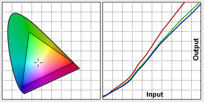
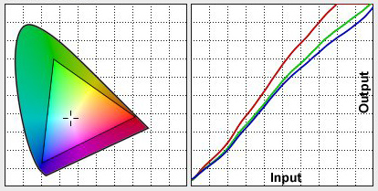
3) CHECK that the calibration is correct. For example, go to http://www.normankoren.com/makingfineprints1A.html and about half way down the page is an image for checking gamma. It should be 2.2 (mac may be 1.8, but there is controversy about whether it should be 1.8). Anyway, I calibrated to 2.2 but when tested, found it was about 2.7!. Recalibrate and tested again. I had to do several tries eventually telling Argyll to calibrate to gamma 1.7 and white point 6500 K in order to get to 2.2. Figure 3 shows this bad calibration (with gamma 2.7) and Figure 4 shows the final, great calibration.
Compare the triangle in Figure 4 with that in Figure 2, showing how much larger the gamut of the calibrated monitor is over sRGB. The wider gamut gives bluer blues, redder reds, and greener greens. It also significantly improves cyans and this the color of a blue sky, Note too, the input-output transfer curve and how it is not straight on this monitor.
Once I had a verified calibration, the 3 test images were much closer, but still varied depending on settings in different programs.
One would think that if the ICC monitor profile was set at the system
level, that other programs would be using the system, so get the colors
correct. NOT! For example, in firefox, enter (as the URL): about:config
and look at gfx.color_management.display_profile. By default, it is
set to blank, meaning use the system profile. Well it sort of was,
but for some reason I can't explain, it was not complete. On the
gballard.net web site above, in the "FULL COLOR MANAGEMENT" (Value 1)
in Firefox 3.6x section, I did not observe with firefox the behavior
described. I had changed gfx.color_management.mode to 1 (default is
2), but that did not help. What I had to do was load the full path to
the monitor ICC profile, e.g.:
gfx.color_management.display_profile /home/profiles/del30inch-may25_2011.icc
(Note, above is a linux path,
windows will be something like C:\profiles\mymonitor.icc) Once
I did this, I finally had complete consistency within firefox on
the gballard.net web page and when loading the test images from
the web site, as well as when loading my test image into firefox. Note:
I left gfx.color_management.rendering_intent at 0.
Photoshop
edit -> color settings ....
custom
Adobe RGB (1998)
View -> proof colors unchecked.
With proof colors checked, I do not have complete consistency. So now I see, with proof colors unchecked, the same colors between all test images in photoshop, as well as firefox, windows 7 image and fax viewer, and gimp (gimp and firefox under linux). And when I go to my images I've posted on the web, I see the same colors as my images in photoshop (viewing the web with firefox or seamonkey).
Gimp
Gimp in Linux uses the system ICC profiles, so works correctly with no changes in settings from when it was installed (at least for the Ubuntu distribution). (Note, I do not use Gimp for my main photo editing because it does not yet handle 16-bit images--that is supposed to come in version 3.)
Conclusions
If you are seeing any color shifts between Adobe RGB and sRGB, and postings on the web, your colors settings are not correct, and/or you are not using a color managed web browser.
Plug in the hardware calibrator and center on the screen to be calibrated, then run dispcal:
dispcal -yl -v -G 1.7 -T 6500 -F -o mymonitor-profile-adate
Example:
dispcal -yl -v -G 1.7 -T 6500 -F -o del3007WFPH_6500K_2011_05_25_v1.icc
Check the man pages to be sure the above are appropriate for your system. For example, -yl is for LCD monitors.
A menu comes up:
Press 1 .. 7
1) Black level (CRT: Offset/Brightness)
2) White point (Color temperature, R,G,B, Gain/Contrast)
3) White level (CRT: Gain/Contrast, LCD: Brightness/Backlight)
4) Black point (R,G,B, Offset/Brightness)
5) Check all
6) Measure and set ambient for viewing condition adjustment
7) Continue on to calibration
8) Exit
I type 5, then 6, then 7. Step 7 takes about 37 minutes on my system.
It creates a file mymonitor-profile-adate.icc
(type in the actual date for adate).
Next run: dispcal -yl -v -r
My system gave:
Aprox. gamma = 2.17.
Contrast ratio = 513:1
White chromaticity coordinates 0.3140, 0.3243
White    Correlated Color Temperature = 6469K, DE 2K to locus =  0.2
White Correlated Daylight Temperature = 6472K, DE 2K to locus =  4.5
White        Visual Color Temperature = 6463K, DE 2K to locus =  0.2
White     Visual Daylight Temperature = 6650K, DE 2K to locus =  4.3
| Home | Galleries | Articles | Reviews | Best Gear | Science | New | About | Contact |
http://clarkvision.com/articles/calibrating.your.monitor
First Published May 29, 2011
Last updated July 7, 2013.