ClarkVision.com
| Home | Galleries | Articles | Reviews | Best Gear | Science | New | About | Contact |
Lighting, Composition and Subject
Composition Part 1: Introduction
by Roger N. Clark
| Home | Galleries | Articles | Reviews | Best Gear | Science | New | About | Contact |
by Roger N. Clark
The direction and quality of the light on the subject are the most important keys to image impact. Where the subject and other elements are located within the scene is the composition. The lighting, composition and subject(s) combine to give an image impact.
The Lighting, Composition and Subject Series:
Introduction
The arrangement of the visual elements in the scene and how it draws in the viewer make the composition. There are many forms of composition, including lines or curves that lead the viewer to a subject. The placement of the main subject has an impact on the viewer, as do other objects in the scene.
But there are many aspects of composition that are to be interpreted by the photographer, and "rules" of composition can certainly be broken. Rules? There are no rules. There are guidelines. What aspects of the composition guidelines you use may also be influenced by your intended target audience. For example, if photo internet critique web sites, you'll get more "wow great photo!" responses if you adhere to formula composition than originality and an artistic style that might not fit traditional compositional "rules" like "rule of thirds."
I'll first discuss the common compositional guidelines, show examples, then break the rules.
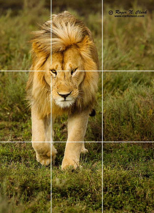
The "rule of thirds" says it is said to be more pleasing to place the subject about 1/3 of the way from an edge rather than dead center. Examples: Figures 1 and 2.

Horizons should be parallel to the edge of the frame. Except when they shouldn't.
Avoid distracting elements, such as branches sticking into the frame, and bright areas that draw the eye away from the subject.
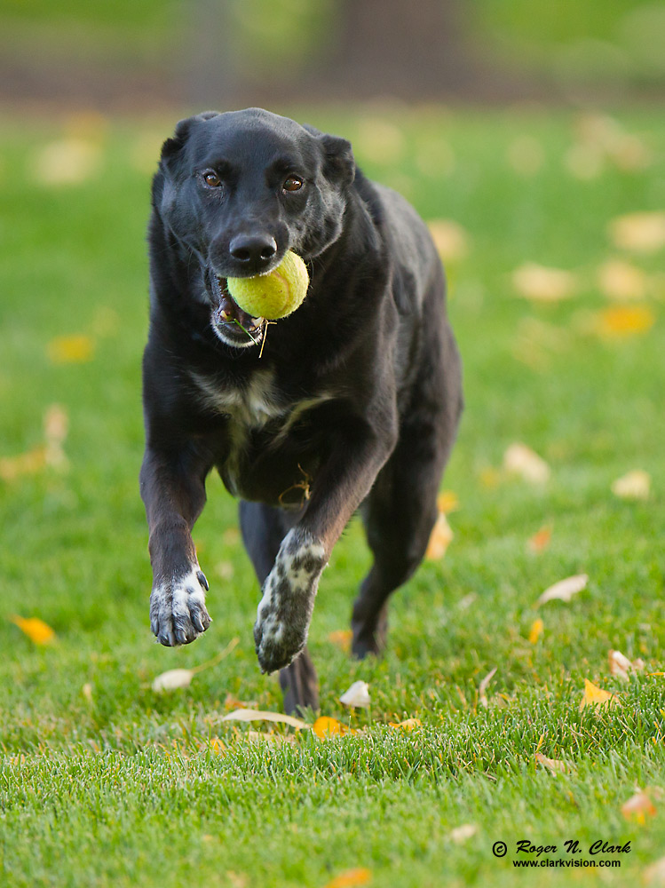
Perspective: the position of the camera relative to the subject. Choose a perspective that helps the viewer connect with the subject. For example, a picture looking down on a dog looking up at the camera is usually less effective than working at eye level. Example: the lion in Figure 1 was made close to the eye level of the lion. Note: people on safaris tend to photograph from the open top of safari vehicles. That perspective is usually too high. I more often photograph as low as I can get so I am at the animal's eye level. Example: Figure 3.
Include patterns, lines, and texture as part of the composition and use them to enhance the subject.
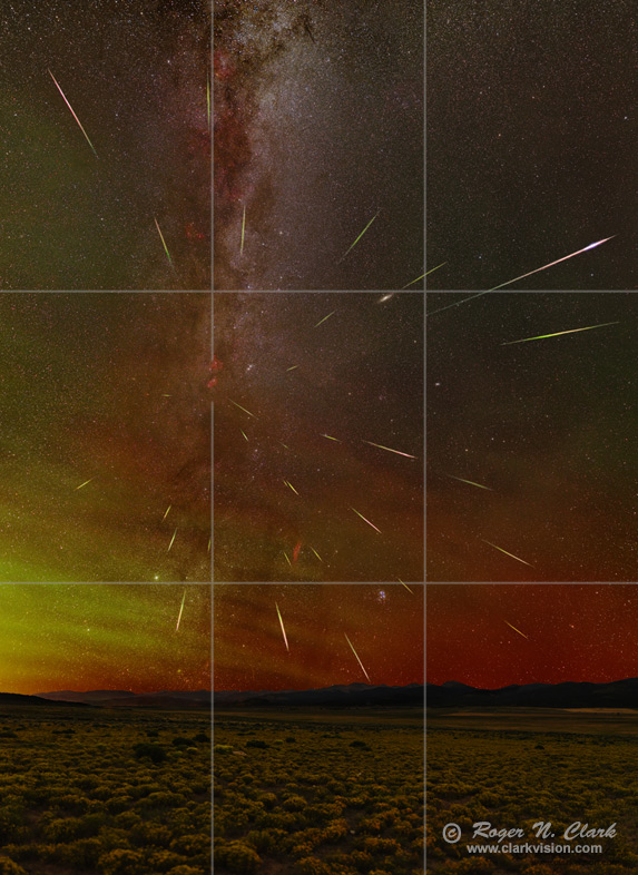
Leading lines and curves can guide the viewer to the main subject. Lines and curves are generally more effective if diagonal in the frame. Leading lines can include rays of light. Examples: Figure 4 and 5.

Objects toward the corners of the frame, and especially the bottom corners can have greater impact. If that is not your main subject, be careful that they don't distract from your subject.
Contrasting colors can lead the viewer to the main subject.
The edges of the frame are sensitive. Be careful with objects near the edge. For example, a tree trunk might be at the edge to frame the subject, but if that tree trunk is brightly lit, brighter than the subject, it can pull the viewer away from your subject.
Strong shapes can attract the viewer's attention. Humans are good at finding shapes, e.g. triangles, rectangles, circles. Use shapes to lead the viewer to the subject and not distract the viewer from the subject.
Some say the simpler the composition, the stronger the image. While this can be the case, sometimes complexity it better.
There are exceptions to the above guidelines.
An example centered composition is shown in Figure 6. Would a rule of thirds composition have been better? Maybe, but not necessarily. Of course the composition decision is left to the photographer and not everyone need agree on the "correct" one as there is no "correct" composition.

The Lighting, Composition and Subject Series:
| Home | Galleries | Articles | Reviews | Best Gear | Science | New | About | Contact |
http://clarkvision.com/articles/composition.part1
First Published November 1, 2014.
Last updated November 14, 2015.