ClarkVision.com
| Home | Galleries | Articles | Reviews | Best Gear | Science | New | About | Contact |
Color Part 1:
CIE Chromaticity and Perception
by Roger N. Clark
| Home | Galleries | Articles | Reviews | Best Gear | Science | New | About | Contact |
by Roger N. Clark
The Color Series
Introduction
CIE Chromaticity: XYZ Color Matching Function Calculations
Stiles and Birch Chromaticity: The 1931 Color Matching Function Calculations
CIE Color Errors
The White Point
Discussion and Conclusions
References and Further Reading
I am going to open a can of worms with this article about color. The number of colors that a human with "normal" eyesight can see and distinguish is really quite amazing. So too are the devices humans have invented to display color, from prints, to CRTs TV screens, flat panel LCD screens, LED monitors and the latest high tech as of this writing, OLED TVs and computer monitors. The color technology world is changing, and is being led by the video industry (circa 2016+). For the last couple of decades, photographers working with digital images have predominantly used sRGB and Adobe RGB color spaces and displayed images on paper (about 5 stops of dynamic range), CRTs and then LCD and LED flat panel computer monitors and TVs. LED flat panel monitors raised the dynamic range to 8 to 10 stops, still well below many common scenes in everyday life. Now we have new standards with wider color gamuts and much higher dynamic range, e.g. in OLED television and computer monitors, and similar High Dynamic Range (HDR) display technology. This new technology is moving forward fast with the new era of Ultra High Definition (UHD) 4k (8.3 megapixels) and 8K (33 megapixel) movies with high dynamic range display capability. Where high dynamic range shines in my view is in highlights: sun glints off of water look real. A campfire looks more like a real campfire with detail like you are there. Lights in an indoor scene can have the same brightness as lamps in the room you are viewing the TV monitor in. Metals have a shiny look like real metal. In summary, more lifelike; more realistic. But there are kinks in the technology and how it is applied.
As with any such advanced technology, standards can be a good thing. But standards can have limitations and sometimes may stifle advancements. In this article, I'll expose some of the limitations and misperceptions of the common standard in use today, the CIE chromaticity model and the use of this standard for color. The CIE model is a color standard for devices and is not a color model of human color perception, but even as a standard for devices, it is is based on multiple approximations.
Here, I am going to jump into the deep end of chromaticity. For an introduction to chromaticity, the CIE chromaticity diagram (Figure 1), how it came to be, see this excellent article A Beginner's Guide to (CIE) Colorimetry by Chandler Abraham, and the more technical article by Fairman et al. (1997, see references below). Basically, the CIE chromaticity diagram was created in 1931, but compromises were made. Specifically, back then the calculations were done by hand and they did not want to deal with negative numbers, so they transformed the original data into all positive response functions, assumed the transforms are linear, and this has led to approximations built on approximation built on approximation. Fairman et al. concluded "We have undertaken to show how the formulating principles of 1931 played an overwhelming role in determining the values of the standard data for colorimetry, which have pervaded the science of colorimetry for the past 65 years. We have shown that likely none of these formulating principles would be adopted if the system were formulated from a fresh start today."
To be clear, the original experiments to derive the the human spectral response is based on color perception. As such, the original data includes perception, which includes negative response to some colors in some conditions. This negative response comes from the multi-stage processing of signals to produce perceived color. At the retinal stage, light is absorbed and generates an electrical signal. Second stage processing includes opponent processes where one color inhibits another. See Theories of Colour Vision, U. Calgary and Gegenfurtner and Kiper (2003) for more information.
What I intend to show in this series are some of the limitations of the CIE chromaticity, how perceived color may be different than CIE color, the color your digital camera may record, and what your computer monitor might display. This series will also discuss limitations of color spaces and illustrate why it is difficult to record and show some colors, specifically deep green, deep blue, and violet colors.
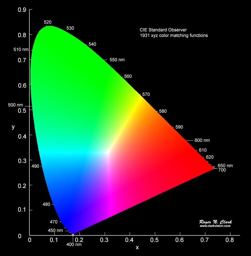
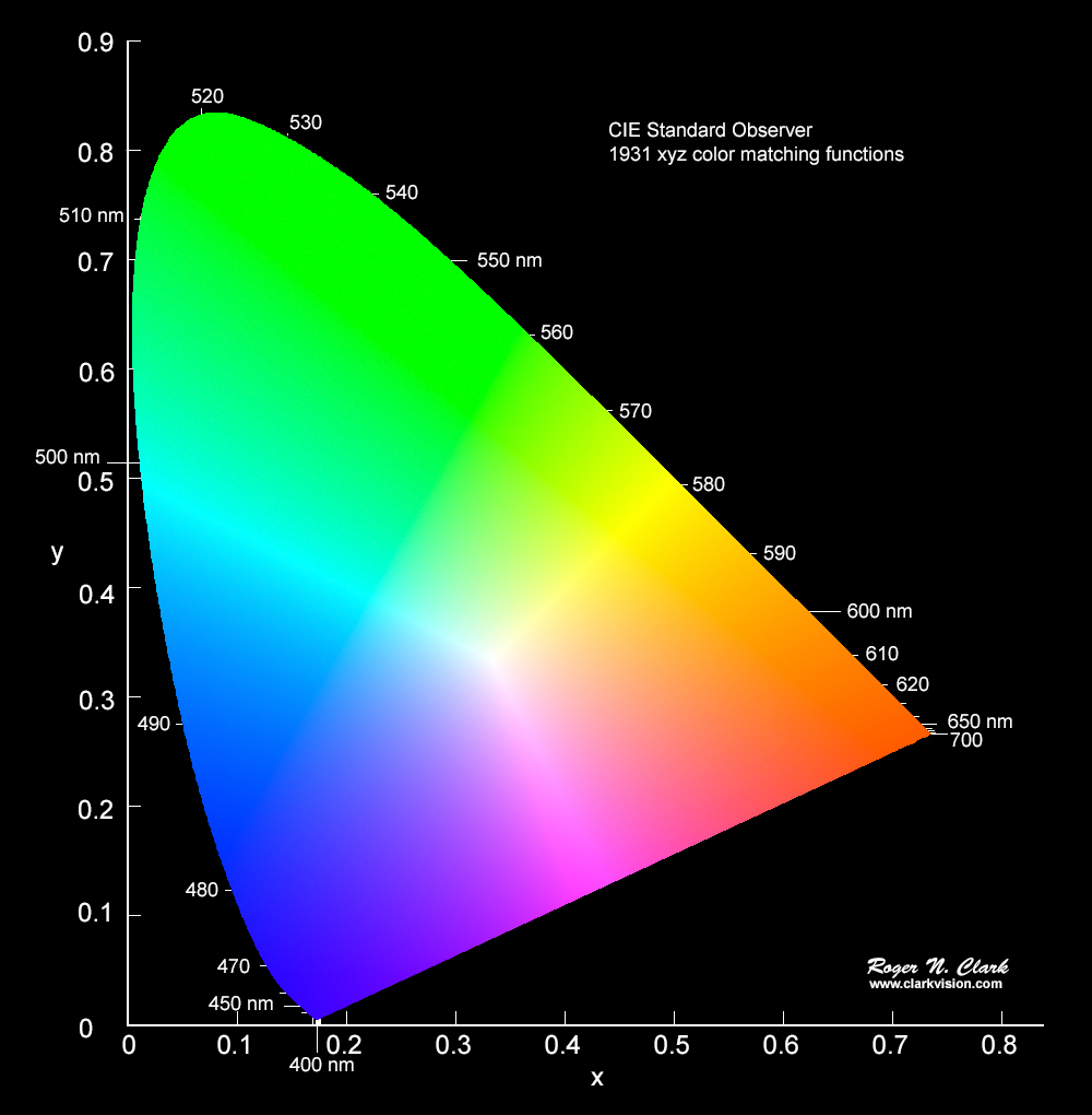
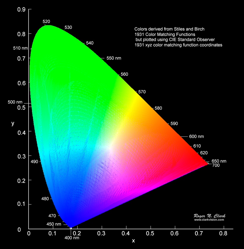
The standard CIE chromaticity diagram is shown in Figure 1. This is a new independent calculation I made by computing the chromaticity from 2.5 million synthetic spectra. No RGB computer monitor available today can display all the colors that can be seen by the human eye. In Figure 1, the colors are in the sRGB color space, so most of the greens look the same, as do reds in the lower right corner, in the deep blues, and the violets are seen as blue not the perceptually distinct spectral colors of violet.
Witzel (2015), a color vision research scientist, discusses what are the fundamental differences between color space and color model? He states "RGB, HSV, HSL, HSI, CMYK do not attempt to model or describe colour perception or appearance, but describe the intensities of the colour channels of a device, e.g. the primaries of a CRT monitor or the sensors of a camera." CIE chromaticity is a color standard for devices, and only roughly describes the first stages of color perception (Bangert, 2015). Gegenfurtner and Kiper (2003) showed there is a second stage of color opponent processing. Witzel argues the CIE model is only coarsely approximate. Witzel and Gegenfurtner (2013) and Witzel et al., (2015) showed data on color perception and errors in perception from models. Here I will show that the approximations in the CIE system begin with the decisions made in 1931 (Fairman et al., 1997) to create all-positive XYZ response functions.
For the Internet Experts. The colors in the chromaticity diagrams in this article are linear sRGB. Thus, the colors appear more saturated than if a tone curve was applied. This is by design to show color differences without the additional confusing factors of tone curves. The fact is that in this article no chromaticity figure needed to be presented with ANY color--they could all be black and white and the conclusions exactly the same. In the second articles, the chromaticity diagrams could also be made with no color background, and again no change in conclusions. The main point of the this article is to show that the CIE model approximations lead to large errors in chromaticity, e.g. Figure 11a, which is about position on the chromaticity diagram, not the specific color of a point on the diagram. Same with Figure 12, where I could have coded the diagram in black and white with the color difference as a change in grey level. I will deal with tone curves and exposure and the problems they create in article 3, but that will be in the future.
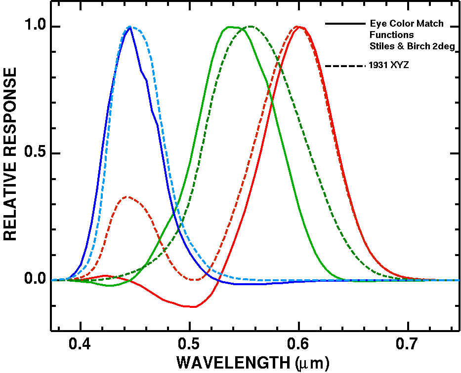
As discussed in the A Beginner's Guide to (CIE) Colorimetry article by Chandler Abraham, and the wikipedia article, the CIE 1931 color space, the original derivation of color response that was incorporated into the CIE model from the Stiles and Birch 1931 color matching functions. The two sets of functions are shown in Figure 2. Note there are also the CIE 1931 RGB color matching functions which are smoothed versions with shifted peak response wavelengths from the original Stiles and Birch 1931 color matching functions. I will not discuss those here--it is just another approximation and simplification of the original data.
For the Internet Experts. I have been accused that it is nonsense to compare one set of curves against a transformed set of curves as in Figure 2. This article I am not doing that. I am comparing METHODS that use different response functions.
Method A) Use the original experimental results (Stiles and Birch). Result = a set of RGB.
Method B) The CIE method uses numerical integration of all positive functions followed a 3x3 matrix transformation to get to an approximation of the original color perception experimental results. Result = a set of RGB.
How does RGB from method A compare to RGB from method B?
The CIE chromaticity diagram (Figure 1) is computed by integrating the X, Y, and Z functions times the object's spectral response function over visible wavelengths, λ. The diagram in Figure 1 results from constructing 2.5 million synthetic spectra, multiplying by the X, Y, and Z functions, then computing the x and y coordinates.
Specifically:
X = ∫ S(λ) * x̄(λ) dλ (eqn 1a),
Y = ∫ S(λ) * ȳ(λ) dλ (eqn 1b),
Z = ∫ S(λ) * z̄(λ) dλ (eqn 1c).
Then the result is normalized:
x = X / (X + Y + Z) (eqn 2a),
y = Y / (X + Y + Z) (eqn 2b),
z = Z / (X + Y + Z) = 1 - x - y (eqn 2c).
Because x + y + z = 1 by definition, then z can be predicted by x and y, so we can simplify a chromaticity diagram by plotting only x and y, as in Figure 1.
Similarly, chromaticity can be computed from the Stiles and Birch (S&B) color matching functions (equations 3-4).
S&B R = ∫ S(λ) * r̄(λ) dλ (eqn 3a),
S&B G = ∫ S(λ) * ḡ(λ) dλ (eqn 3b),
S&B B = ∫ S(λ) * b̄(λ) dλ (eqn 3c).
and
S&B r = R / (R + G + B) (eqn 4a),
S&B g = G / (R + G + B) (eqn 4b),
S&B b = B / (R + G + B) = 1 - r - g (eqn 4c).
Note that the above integrals are simplified. The spectrum, S(λ) may include the spectrum of the illuminant. See the wikipedia page for more details: CIE 1931 color space,
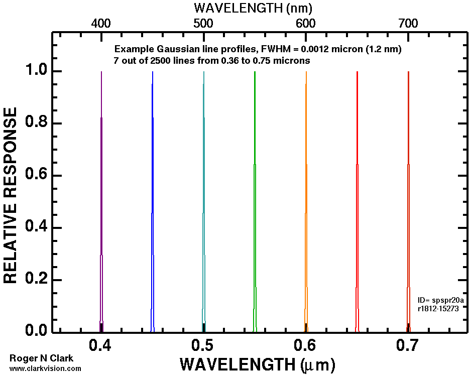
Next I computed a series of spectra, marching a single Gaussian-shaped emission line across the spectrum from 360 nm to 750 nm. The first calculation used an emission line width of 1.2 nm (Full Width at Half Maximum, FWHM). These spectra form the outer shell of the horseshoe-shaped CIE diagram. The calculation results are shown in Figure 3. Then I computed the same emission line positions, but with different widths, 12 nm, 24 nm, 35 nm, etc. These trend lines form a series of contours. Later in this series, I'll show how the contours in Figure 3 can be used to predict the color gamut of a device like an LED computer monitor. Creating contours in the CIE chromaticity like that shown in Figure 3a is not a new concept. Color scientists have been doing this for years, e.g. see Masaoka et al. (2014).
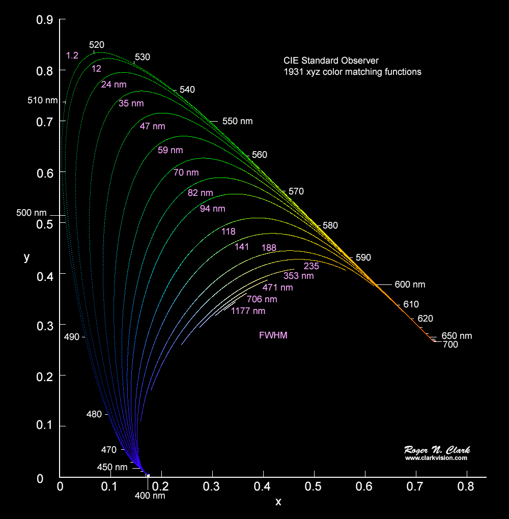
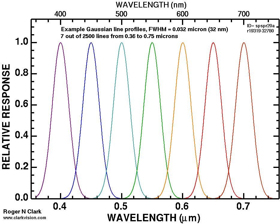
The contours in Figure 3a illustrate a fundamental limitation in color recording, color reproduction, and color perception. What the data show is that to produce a saturated green color with wavelengths in the 500 to 550+ nm range, a very narrow emission line is needed. People with normal vision can distinguish the hue (wavelength) in very small changes in the green range. That means to record those small changes a narrow response function is also needed. But a narrow spectral response of a 3 color digital camera would miss seeing other colors. So from the start, recording color with a simple 3-color channel camera limits the possible colors that can be distinguished. For example, consider a digital camera that had narrow color filters like the blue, green and red responses in Figure 3b. Then if the camera was pointed at a light source with the orange emission spectrum (in Figure 3b) would not be seen at all. Thus, the filters in digital cameras are broad so that many colors can be recorded by the camera.
Another problem with narrow emission output devices, like an LED computer monitor with narrow with red, green and blue LEDs is the production of yellow. Yellow is perceived as a unique spectral color and not a mixture of red and green! This is called the Red-Green Yellow Paradox (Bangert, 2015). While one can use red and green LED flashlights to make a yellowish color, the perceived color is not the pure yellow of a narrow yellow emission line.
The display of an image on a computer monitor or television can use narrow spectral response functions, and we will see in part 2 the abilities and limitations of different output spectral response functions. For the rest of this article, I'll be exposing the approximations and errors such approximations have in the CIE model.
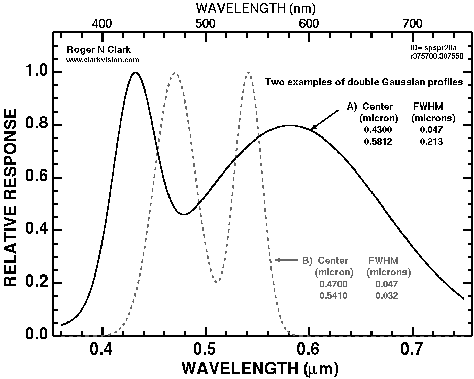
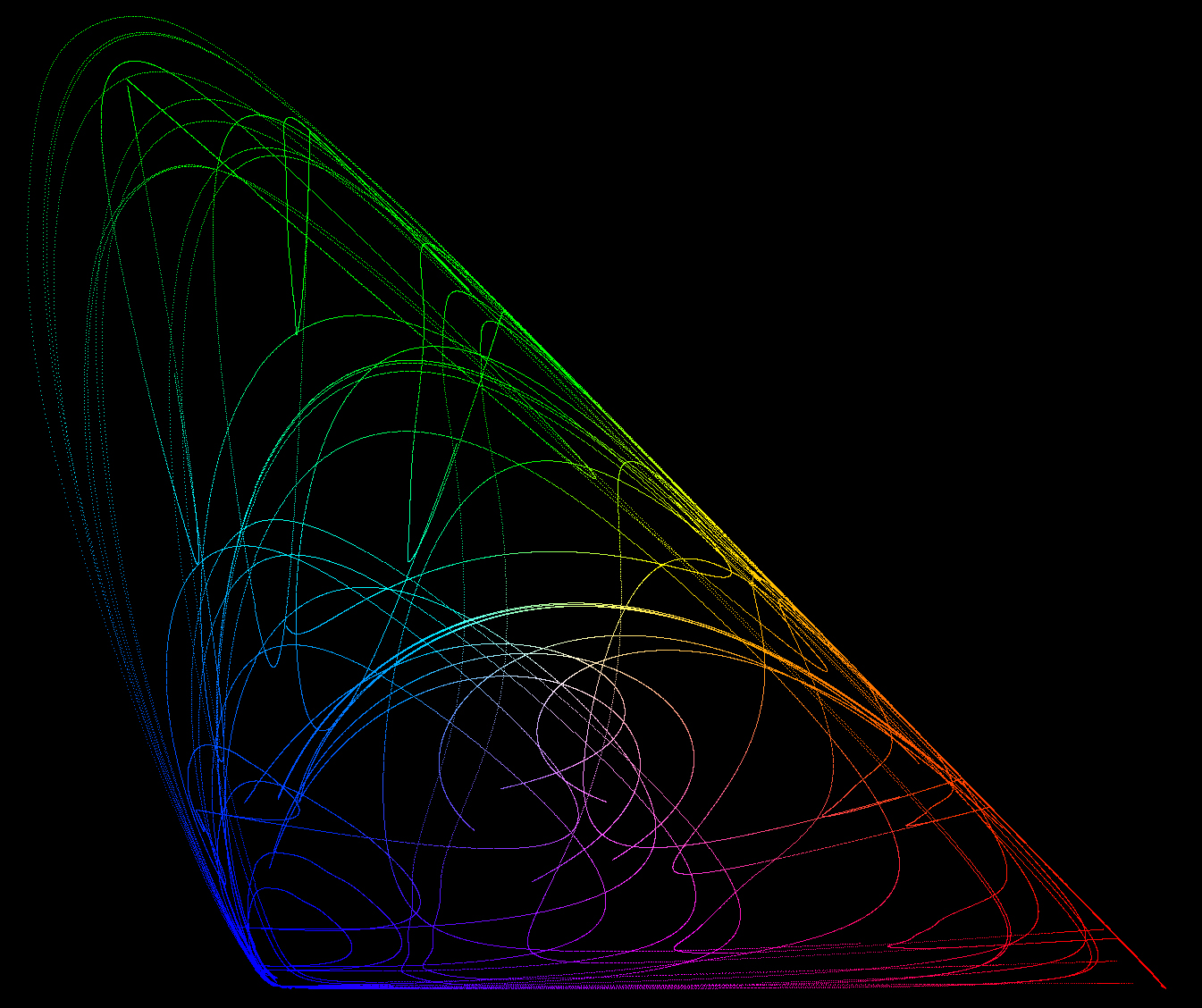
Next, spectra were computed using 2 spectral features, each of different positions and different widths. One position and width was fixed while the second feature, with a different width, had the position moved over the 360 nm to 750 nm in 2500 steps. The choice of 1st position and width plus the second feature width determined the track of the lines in Figure 4a, 4b. Example spectra are shown in Figure 5. The fully populated diagram is shown in Figure 6. Note the colors in Figures 4a, 4b, and 6 are less saturated than in Figure 1. The advantage of computing spectra along such trends is that contours are illustrated (e.g. Figure 4a) and can be used to diagnose errors and to better understand what spectral properties result in particular colors and color trends.
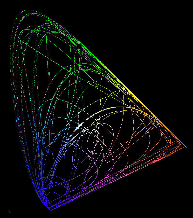
The two Gaussian spectra calculations, example spectra shown in Figure 4c, are relatively simple spectra compared to many types of light in today's world. Natural light includes complex spectra of minerals (See Kokaly et al., 2017, the US geological Survey, Spectral Library Version 7), and some natural materials fluoresce with complex spectra. If you do astrophotography or night sky photography, emission nebulae, aurora and airglow have more complex spectral structure than the simple two-Gaussian component spectra used for this study. Man-made lights and materials also show complex spectra, from neon signs, colored LEDs, and exotic dyes use to make products. Depending on the spectral complexity, perceived color can depart significantly from CIE chromaticity.
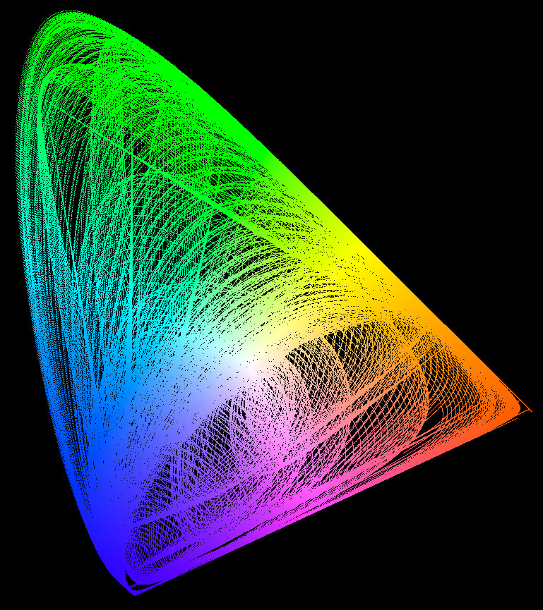
The assigned red, green and blue colors in Figure 6 are not as saturated as in Figure 1 because the 1931 XYZ matching functions are all positive and broader in their spectral response than the Stiles and Birch 1931 color matching functions. This was by design because back in 1931, calculations were done by hand and subtraction took more effort, so they made the functions positive. So the colors in Figure 6 and not really RGB colors. They need to be transformed into a color space. So sets of equations, each a linear combination of X, Y and Z have were derived. These are approximation equations. Some may say, no they are exact equations (I have read this on the internet). I'll show below that they are not exact.
The colors in Figure 1 were computed using the matrix transform from Bruce Lindbloom: Some Common RGB Working Space Matrices. Specifically, I used the XYZ to sRGB matrix for production of Figure 1 because sRGB is the default color space for the web. So, for each RGB color in Figure 6, equations 5a, 5b, and 5c were used to compute the sRGB colors in Figure 1. To be clear, these are approximation equations.
red = 3.2404542 * X - 1.5371385 * Y - 0.4985314 * Z (eqn 5a)
green = -0.9692660 * X + 1.8760108 * Y + 0.0415560 * Z (eqn 5b)
blue = 0.0556434 * X - 0.2040259 * Y + 1.0572252 * Z (eqn 5c)
Remember X, Y, and Z are integral functions so this is not just a simple linear equation. Combining equations 1 and 5, we see the complexity of the equations:
red = 3.2404542 * ∫ S(λ) * x̄(λ) dλ
- 1.5371385 * ∫ S(λ) * ȳ(λ) dλ
- 0.4985314 * ∫ S(λ) * z̄(λ) dλ (eqn 6a)
green = -0.9692660 * ∫ S(λ) * x̄(λ) dλ
+ 1.8760108 * ∫ S(λ) * ȳ(λ) dλ
+ 0.0415560 * ∫ S(λ) * z̄(λ) dλ (eqn 6b)
blue = 0.0556434 * ∫ S(λ) * x̄(λ) dλ
- 0.2040259 * ∫ S(λ) * ȳ(λ) dλ
+ 1.0572252 * ∫ S(λ) * z̄(λ) dλ (eqn 6c)
Compare the solid and dashed curves in Figure 2. Look at the red pair. The dashed red line (CIE CYZ) is above the solid (Stiles and Birch) red line at all wavelength less than 0.6 micron (600 nm). To get to color perceived in the Stiles and Birch data but using the positive XYZ functions, some green and blue needs to be subtracted. And that is exactly what we see in equations 5a and 6a: green (Y) and blue (Z) are subtracted from red (X) to derive a red color closer to what is perceived by people with normal vision. Now look at the green lines in Figure 2. We see the dashed green line above the solid green lines at wavelengths above about 0.55 micron (550 nm) and mostly below at shorter wavelengths. Thus, we would predict that green would subtract some X (red) from Y (green) and add some Z (blue), and that is exactly what the constants indicate in equation 5b and 6b. Blue is similar, though a little more complex. The blue dashed line is above the blue solid line, so some green (Y) is subtracted. But why is a small amount of red (X) added? Look at the violet, 0.40 to 0.42 micron (400-420 nm). There we see the solid line is above the dashed line and violet is somewhat similar to purple (red + green), so adding in a little red is somewhat similar to violet. This is not exactly true, as violet is a distinct spectral color not modeled well by either Stiles and Birch or CIE XYZ, but is another approximation. This approximation impacts the predicted color of some blue spectral shapes, and an example spectrum is the blue sky. The color of a high elevation clear blue sky which has strong violet and ultraviolet intensities is where perception and prediction by the CIE model and to a lesser degree Stiles and Birch notably depart from perceived color. More on violet and ultraviolet perception in Parts 2 and 3 of this series.
The next step is to compare results like those shown in Figures 1-4 with the original data, the Stiles and Birch 1931 Color Matching Functions.
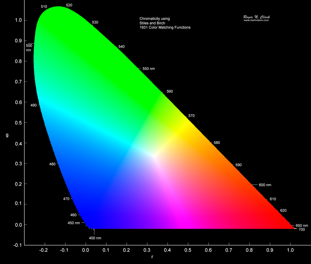
We can do the same calculations using the Stiles and Birch color matching functions as was done above. Because the functions have a different shape, the resulting chromaticity plot has a different shape, and because the Stiles and Birch functions have negative components, the results shown in Figures 7 and 8 have negative components.
One can read in online articles, and even in scientific articles that the Stiles and Birch color diagram can be transformed to the CIE diagram with a linear transform and that is discussed in the Chandler article referenced at the beginning of this article. While it is true that one can do a linear transform, it is only an approximation. Yet another approximation!
Another way to look at the problem is to plot the CIE XYZ outline on the Stiles and Birch diagram. That is shown in Figure 9. A key thing to notice is that the peak of the CIE chromaticity horseshoe shape occurs in the green near 520 nm (Figure 1), and near 510 nm in Stiles and Birch (Figure 9). This is the first key that there is no exact linear transform to change Stiles and Birch into the CIE model. How can the outline of the Stiles and Birch color diagram be linearly squished to the outline of the CIE line in Figure 9?
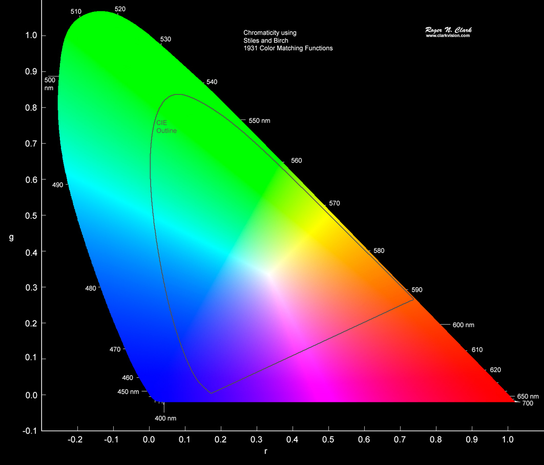
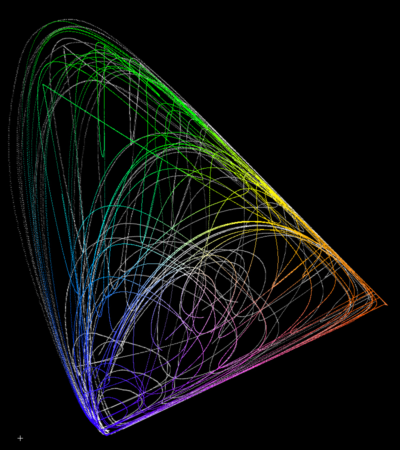
Trend lines like that in Figure 4a for the XYZ functions are shown for the same 125,000 spectra using the Stiles and Birch color matching functions are shown in Figure 7. Now according to web articles and scientific papers, we should be able to linearly transform the data in Figure 7 to exactly match the CIE data in Figure 4a. Examine Figure 9, where we see the CIE outline is superimposed on the Stiles and Birch chromaticity. Can the Stiles and Birch be "squished" linearly to exactly match the Cie diagram? To illustrate if this is true, I changed all to colored points in Figure 7 to white then linearly transformed the diagram to match closely the vertices of the Figure 4a CIE diagram, and tried to make the widths of the horseshoe shape the same. The closest I came is shown in Figure 10. If the match were perfect, no white trend lines would be seen. Clearly that is not the case. The closest matches occur in the red, but divergence is greater in the green and greatest in the blue. Clearly there is no linear transformation that is an exact transform to make the two diagrams match.
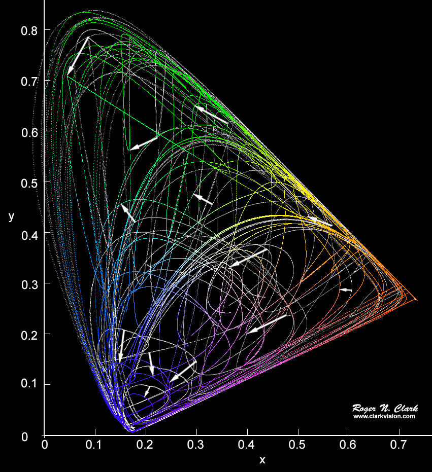
What this means is that from the fundamental Stiles and Birch data, the transform to all positive matching functions is only an approximation to perceived colors! So at the very start, we have an approximation. The magnitude of some of the errors are illustrated by the white arrows in Figure 11a. Errors in x and y are many percent, increasing in the blue where errors reach over 30% for the simple two-Gaussian spectra used to make the comparison. One might expect more complex spectra to show even greater errors.
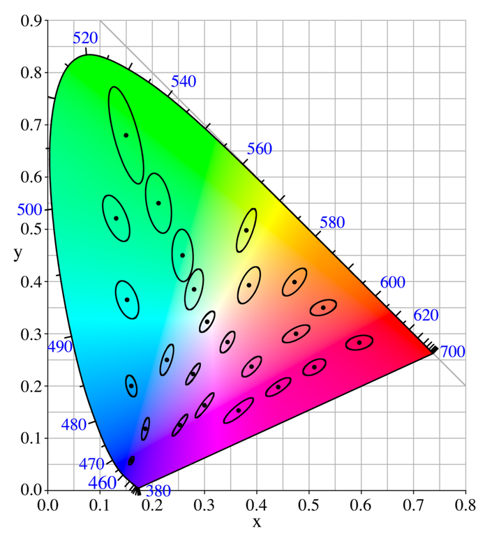
Compare the magnitude of the errors in Figure 11a with the "Just Noticeable Difference, JND" ellipses in Figure 11b. Difference in Figure 11a are greater than the JND ellipses for ALL COLORS, but are much greater in the blue. Indeed, researchers are reporting greater perceptual errors with CIE chromaticity in the blue (e.g. see Witzel and Gegenfurtner, 2013; Witzel et al., 2015). The magnitude of the errors are significantly larger than the "Just Noticeable Difference" (JND) of color perception. Compare the JND ellipses in Figure 11b with the magnitude of the white arrows in Figure 11a.
Another way to illustrate the discrepancies between Stiles and Birch chromaticity and CIE matrix approximation chromaticity is to compute Stiles and Birch RGB, but plot the color at the CIE x, y coordinates. That is done in Figure 12. If the CIE XYZ color matching functions and CIE xy diagram were an exact linear transformation of the original Stiles and Birch data we should see smooth color gradients in Figure 12, but we do not. Some spectra have colors that plot at a CIE xy position that is inconsistent with color from different spectra at the same and nearby xy coordinates. This is an indication that the CIE XYZ model is only an approximation to the original Stiles and Birch data and that some spectra, particularly in the blue, produce significantly different colors. Discrepancies like that shown in Figure 12 are also borne out in scientific color perception studies, as previously noted.
Huge discrepancies are seen in the green in Figures 11a and 11b. Those don't appear in Figure 12 because all the greens in the upper left part of the diagram are out of gamut for pretty much any monitor in use today.
Could the transform to warp the Stiles and Birch chromaticity to the CIE chromaticity in Figures 11a and 11b be the cause of the discrepancies? No because it was a linear transform. The results shown in Figure 12, which used no warping transforms, shows the discrepancies in another way. It was made, as stated above, by computing the Stiles and Birch RGB and with the same spectra, compute the CIE chromaticity and plot the Stiles and Birch RGB at the CIE chromaticity coordinate.
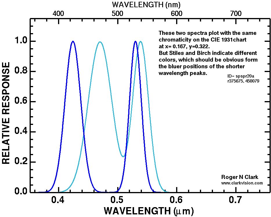
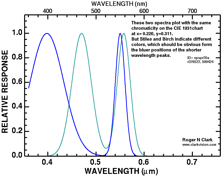
Example spectra illustrating different spectral properties but the same CIE chromaticity are shown in Figure 13a and 13b.
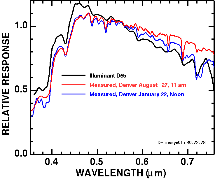
There are several standards for white point, and the white point controls the overall color balance of an image. In the color spaces for sRGB, Adobe RGB, DCI-P3 and others, the white point is D65: "D65 corresponds roughly to the average midday light in Western Europe / Northern Europe (comprising both direct sunlight and the light diffused by a clear sky), hence it is also called a daylight illuminant." This may not be close to daylight for a typical outdoor scene. Differences in measured versus the D65 standard are illustrated in Figure 14. Further, the D65 standard is for mid-day sun, but many photographers prefer to make images in late afternoon or early morning when the sun is lower and the spectral distribution of sunlight and light from the sky are different. What this means is that, while the CIE is a standard, it my not apply to your situation. This color derived from your camera may be different than if the reflectance of the object being photographed were measured and the CIE chromaticity computed using D65 illuminant. Depending on intent, I argue that CIE chromaticity is not relevant if you want to produce perceived color, especially for late afternoon or early morning photography. This may require a custom white balance to be measured on site, near the same time as images of the subject are made.
CIE chromaticity is a standard, but is not a standard for human color perception. As such, CIE chromaticity is built on simplifications and approximations that depart from perceived colors, and in some cases significantly, depending on spectral complexity.
Fairman et al. (1997) made the politically correct presentation saying we would not choose this method if the decisions were made today (the 1990s). Here we are over twenty years later with the same problems from the 1930s. I will not be politically correct and smooth over these problems. The simplifications and approximations of the CIE standard date from the 1930s when people did not want to do hand calculations with negative numbers. Modern computers for at least the last 70+ years have no such limitations. The simplifications and approximations are now adding confusion and further approximations to a complex world as we move into better color display technology. These simplifications are holding back development and presentation of accurate perceived color. It is time to abandon the current CIE approximation models and get back to the fundamental underlying data on human perceived color.
In the next part of this series, I'll discuss color spaces, the approximations of those color spaces and the implications for producing images with more accurate perceived colors.
A Beginner's Guide to (CIE) Colorimetry by Chandler Abraham.
Bangert, T., 2015, Colour: an algorithmic approach, PhD. Thesis, Queen Mary University of London. http://www.eecs.qmul.ac.uk/~tb300/pub/PhD/stage2Report.pdf
CIE 1931 color space, wikipedia.
Fairman, H. S., M. H. Brill, and H. Hemmendinger, 1997, How the CIE 1931 Color-Matching Functions Were Derived from Wright-Guild Data, Color Research & Application, CCC, 22 p. 11-23.
https://pdfs.semanticscholar.org/02fc/45b219c53ca71d24a2ddcea1227c4e4a3703.pdf
Gegenfurtner, K. R., and D. C. Kiper, 2003, Color Vision, Annu. Rev. Neuroscience 26 p. 181-206.
Kokaly, R.F., R. N. Clark, G. A. Swayze, K. E. Livo, T. M. Hoefen, N. C. Pearson, R. A. Wise, W. M. Benzel, H. A. Lowers, R. L. Driscoll, and A. J. Klein, 2017, USGS Spectral Library Version 7 Data: U.S. Geological Survey data release, https://dx.doi.org/10.5066/F7RR1WDJ. https://speclab.cr.usgs.gov/spectral-lib.html
Masaoka, K., Y. Nishida, and M. Sugawara, 2014, Designing display primaries with currently available light sources for UHDTV wide-gamut system colorimetry, Optics Express, 22 DOI:10.1364/OE.22.019069.
Masaoka, K., and Y. Nishida, 2015, Metric of color-space coverage for wide-gamut displays, Optics Express, 23 DOI:10.1364/OE.23.007802.
Witzel, C., and K. R. Gegenfurtner, 2013, Categorical sensitivity to color differences, Journal of Vision 13, p. 1-33.
Witzel, C., F. Cinotti, and J. K. O'Regan, 2015, What determines the relationship between color naming, unique hues, and sensory singularities: Illuminations, surfaces, or photoreceptors? Journal of Vision 15, p. 1-32.
Witzel, C., 2015, What are the fundamental differences between color space and color model? researchgate.net https://www.researchgate.net/post/What_are_the_fundamental_differences_between_color_space_and_color_model
The Color Series
| Home | Galleries | Articles | Reviews | Best Gear | Science | New | About | Contact |
http://clarkvision.com/articles/color-cie-chromaticity-and-perception
First Published May 23, 2019.
Last updated December 20, 2020