Astrophotography Image Processing
with Images Made in Moderate Light Pollution
by Roger N. Clark
Astrophotography post processing with images made under moderate
light pollution can be done simply with modern raw converters
and image editors that can edit in at least 16-bits/channel.
The Night Photography Series:
Contents
Introduction
Raw Conversion
Image Stacking
Light Pollution and Airglow Removal
Enhance
Star Diameter Reduction
Is the Color Gradient Correct?
Try it Yourself With These Images
About the Challenge
Diagnosing Problems Using Histograms
White Balance and Histogram Equalization
Conclusions
References and Further Reading
All images, text and data on this site are copyrighted.
They may not be used except by written permission from Roger N. Clark.
All rights reserved.
If you find the information on this site useful,
please support Clarkvision and make a donation (link below).
Introduction
Below I outline the steps needed to make beautiful astrophotos made under
moderate light pollution skies. A series of nine 1-minute exposures of
the Scorpio region and the Rho Ophiuchus nebula complex was made with a
100 mm lens at f/2 and a stock Canon 6D, tracking on the stars. Figure 1a
shows my finished image. One of the nine images, an out of camera jpeg,
is shown in Figure 1b. As you can see from Figure 1b, the light pollution
and airglow has washed out the image. Multiple exposures, when combined,
increases the signal-to-noise ratio, allowing for weaker signals to
be extracted. The signal-to-noise ratio increases with the square root
of the number of exposures, so the 9 exposures in this example improves
the signal-to-noise ratio by 3 times.
The sky images were obtained from a "green zone" (on the light pollution
scale) west of Denver at an elevation of about 11,000 feet with no
Moon. There is a light pollution gradient from left to right, as well
as airglow. The Milky Way is on the left edge, so there is also a deep
sky brightness gradient from the galaxy. Thus all together, with the
relatively short total exposure time, it will be a challenge to bring
out the nebula, including dark nebulae, hydrogen alpha nebulae, blue
and the yellow reflection nebulae.
The challenge is to produce the best image that brings out the
many colorful nebulae in the region, by removing the veil of the light
pollution and airglow. Examine Figure 1c.
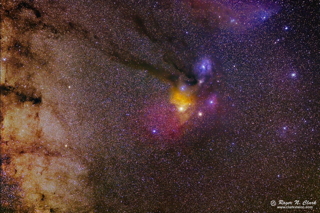
Figure 1a. Finished image.
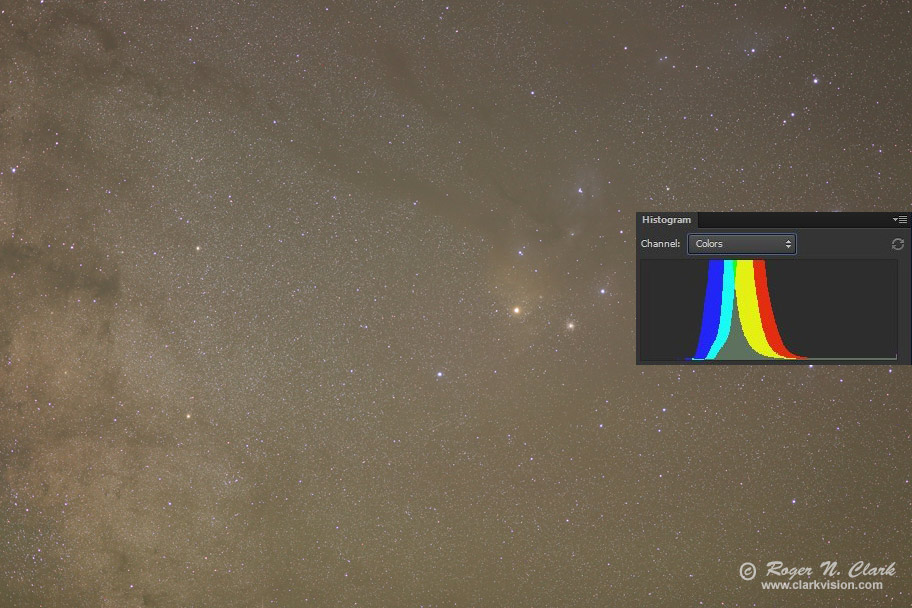
Figure 1b. Out of camera jpeg. Note the histogram is mid-level indicating
stronger than desired light pollution.
Details of the histogram from Figure 1b are shown in Figure 1c. We know
many parts of the night sky are extremely dim, so the large offset,
labeled "Light Pollution + Aiglow" is light added to the signal from
the deep sky beyond Earth, and that the offset is due to light from
cities and other artificial light scattered in the Earth's atmosphere
plus light emitted by the atmosphere (airglow). Note that the offset
is different for each color. That means a different offset needs to
be subtracted for each color. The middle section of the histogram,
where each color peaks, is where the light from nebulae, galaxies,
fainter stars and other deep sky objects is represented, mixed in with
gradients in light pollution and airglow. Airglow often shows as bands,
sometimes bands of red an green. Thus, besides the offset shown by the
left side of the histogram, there are mixed signals in the histogram
peak that need to be separated, and the weak signals from the night sky
beyond the Earth's atmosphere enhanced so we may see them (this is called
image stretching).
I'll show below, that a single constant offset can be done in the raw converter
(Figure 2, right-most panel, blacks set to -83 in this case). Then show
how to subtract the different constants for each color, then how to subtract
gradients and enhance the signals from the night sky to bring out all the
wonderful nebulae and their various colors.
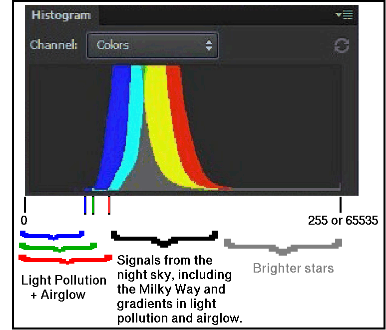
Figure 1c. The histogram of the image in Figure 1b. A histogram is a
plot of intensity on the horizontal axis and number of pixels in a narrow
intensity range (a bin) on the vertical axis. An 8-bit image has an intensity range
from 0 to 255; 16-bit image has a range of 0 to 65535.
The basics of the effects of the curves tool are shown in Figure 1d.
Light pollution should be subtracted, and you can do this by moving
the lower left point in the curves too to the right, and moving it by
different amounts in each color channel, thus subtracting different
amounts of light pollution. Generally, the red channel has the most
light pollution, followed by green then blue.
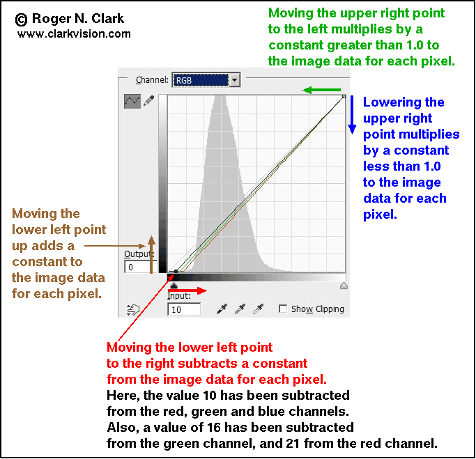
Figure 1d. The curves tool and the math applied to image intensity data.
The effects are:
Moving the lower left point up adds signal and reduces contrast at the low end.
Moving the lower left point to the right subtracts from the image data. Use this to subtract
light pollution. It increases contrast at the low intensity range.
Moving the upper right point down darkens the image, keeping contrast unchanged.
Moving the upper right point to the left brightens the image, keeping contrast unchanged.
Online I see many tutorials that say to align the histogram peak of the 3 color channels.
That is WRONG. Aligning the histogram peaks suppresses the dominant color
in an image. This is discussed in sections below: "Diagnosing Problems Using Histograms"
and "White Balance and Histogram Equalization" where I show examples of the disastrous effects
on image color. Steer clear of any site that tells you to do this to your
images! What we really want to do is establish a good zero point (what is black in an image)?
Instead of aligning histogram peaks, the far better way to process
night sky images is to align the start of the data (the lowest signal).
This establishes a zero point. Of course the true zero point of the
darkest parts in an image may not be color neutral, but because the
signal is so tiny, it provides a best estimate of zero signal. In most
night sky images, there are dark nebulae or gaps between nebulae to
establish a best estimate of the zero point. Aligning histogram peaks
not only does not establish a zero point (what is black), it can skew
the zero point to strange colors. Indeed, online we see many images of
the night sky with varying colors, commonly purple, and various shades
of blue because many things in the night sky are dominantly red (like
the Milky Way) and aligning histogram peaks shifts the image from red
to blue as illustrated in the section below "White Balance and Histogram
Equalization" and Figure 9 in that section.
Raw Conversion
For this image I used the following settings in
Photoshop's Adobe Camera Raw (ACR) (settings in Figure 2):
I used no dark frames subtraction because the Canon 6D has on sensor
dark current suppression, so none are needed. No flat fields were used
because the raw converter removes the light fall-off using the lens
profile. The 5 panels, from left to right in Figure 2 show the settings
I used:
- Enable lens profile corrections.
- Remove chromatic aberration.
- Noise reduction and sharpening.
- No changes to the default tone curve.
- general settings:
- Daylight white balance.
- Exposure -0.5 to 1 stop.
- contrast = 0.
- Highlights about -60 to -80 to reduce star saturation.
- Shadows and Whites = 0.
- Blacks about -50 to -80 (subtracts light pollution).
Note: this is image specific, tune so that no color
channel is clipped on the low end.
- Clarity, Vibrance = 0.
- Saturation about +10 to 15.
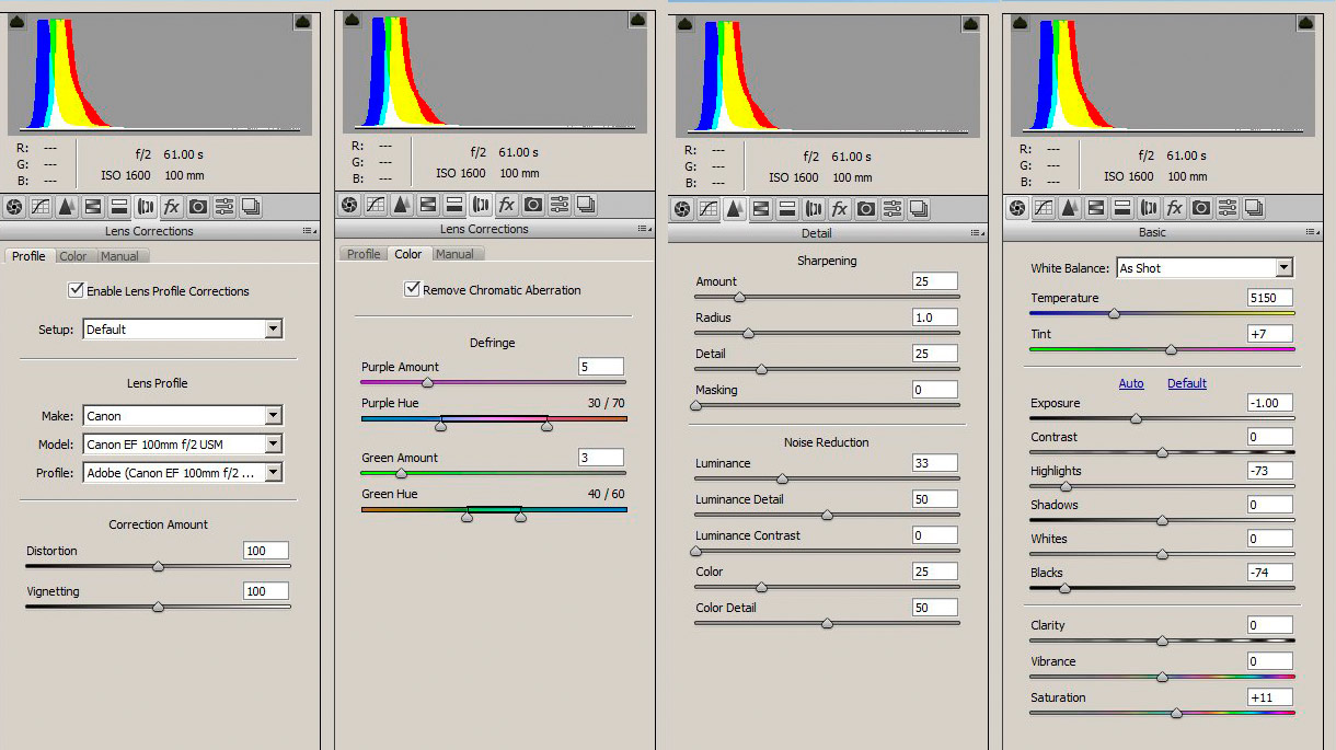
Figure 2. Photoshop's Adobe Camera Raw (ACR) settings used for
this example. ACR panels not shown had no modification from default
settings. Note: chromatic aberration correction is lens specific.
To much defringing will lead to color square-ish halos around stars.
Noise reduction is lens specific too. Use higher luminance noise reduction
(e.g. 33 in this example) when stars are several pixels across like with
this lens and pixel spacing. Sharper lenses use lower settings, like
15 to 25. Examine stars at 100 to 200% view when choosing defringing
and luminance noise reduction amounts and be sure noise reduction does not
erase faint stars. Note the "As shot" white balance is the Canon in-camera
balance I set this on the camera, and was daylight white balance. The Canon
camera daylight white balance differes slightly from the ACR white balance.
Both work well and in practice are very close.
Regarding the raw settings. The large negative Black level subtracts the overall
light pollution level from the linear camera data, moving the remaining light
pollution into the linear region of the standard tone curve that ACR applies.
This enables further light pollution removal without strange artifacts.
Key to this step is to not clip the low end, as some deep space light
is in the tail of the histogram, especially around the dark nebulae.
Next, synchronize all images of the night sky in the raw converter and
save them image as nine 16-bit tiff files.
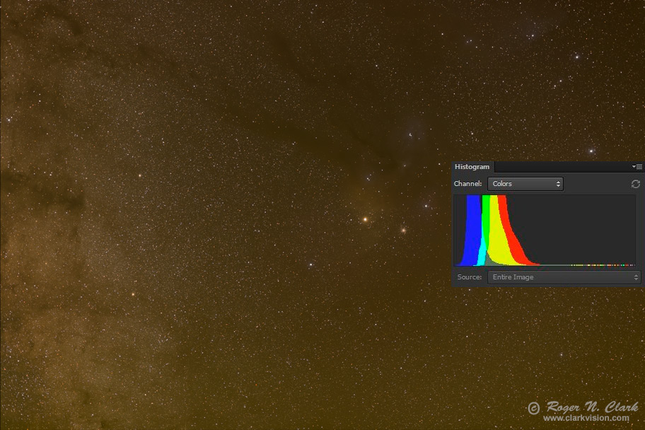
Figure 3. Image and histogram after raw conversion. Notice how the
histogram is further to the left compared to the histogram in Figure 1b,
and the image is darker. That is due to the subtraction of some of the light
pollution and airglow.
Image Stacking
Figure 3 is an example of one image, but I made 9 exposures. I used
ImagesPlus to align and stack. Aligning the images to minimize drift
between frames is important. If there is any shift when the images
are combined, resolution will be lost. Stacking is the method used to
combine the multiple frames into one image (e.g. average). In ImagesPlus,
I selected image set operations, translate only and ImagesPlus produced a
set of 9 tif files where the images are aligned extremely well. You could
also do the alignment by hand in photoshop by stacking the images into
layers and changing the opacity so you can see the image underneath,
then moving one image to match up with the other. That is tedious and
a dedicated astro image processing program is much faster and easier.
Then I combined the 9 images into one by selecting combine files in
ImagesPlus. I used Sigma Clipped average and set the threshold at 2.45
standard deviations.
Figure 3 shows the resulting image from combining the raw files. The
mainly orange color is due to light pollution from sodium vapor street lights
from the Denver metro area. There are many ways to combine images, for example,
a simple average, median, high and low value exclusion average, and others.
I find that sigma clipped average works best with all the astrophotos
and different cameras I have used. Part 3e of this series compares
some stacking methods.
Light Pollution and Airglow Removal
In the image editor use the curves tool to further remove light pollution
by moving the lower left point in the curves tool to the right for each
color channel. (The left slider in the levels tool does the same thing.)
Figure 4a shows an example using the image in Figure 3 (the output of
the stacking) where only the green and red channels have light pollution
subtracted from the entire image. Light pollution is minimum in the upper
left corner and the curves work made the sky a neutral gray in the upper
left corner. Note in the photoshop histogram tool, if a triangle in
the histogram window shows in the upper right corner, the histogram
is not current, and you must click on the little triangle to update
the histogram after each adjustment in any editing step. Failure to
update the histogram may result in clipping because one does not have
accurate information.
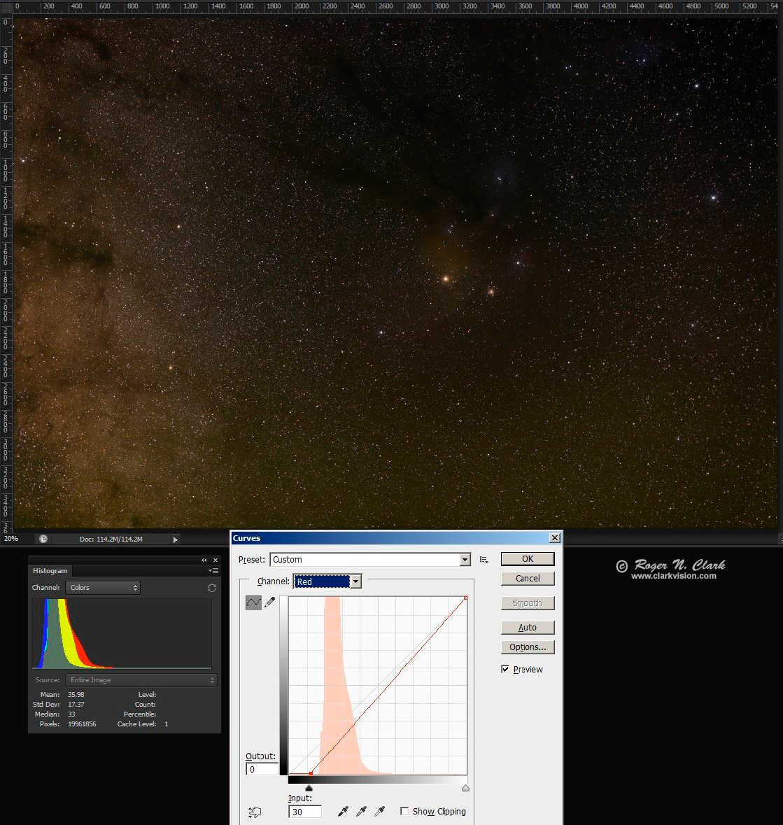
Figure 4a. Example light pollution subtraction by channel. Compare the
histogram in Figure 3 to the one here. By moving the lower left point to
the right, a subtraction is done and the color channel in the histogram
moves left. Here the left edge of the histogram red and green channels
are close and just above the blue histogram left edge. The red channel
is shown in the curves tool. This position neutralized the color in
the upper left corner where there are no apparent nebulae.
The image resulting from the Figure 4a step is darker because we
subtracted values from the image data. So the next step is to brighten
it. Brightening will also magnify remaining light pollution and make the
light pollution gradient from left to right more apparent. This is shown
in Figure 4b. To increase brightness without saturating more stars,
use the curves tool and make the RGB curve convex upward (Figure 4b).
Where the slope increases, contrast is enhanced and small differences
in intensity become more apparent (Figure 4b, burnt orange arrow).
Similarly, where the slope decreases, intensities are compressed and
contrast is reduced. The faint signals of nebulae are close to the sky
level, so the shape of the curve in Figure 4b helps. Also helping is
subtracting a small amount of red and green from the remaining airglow.
The amount to subtract is found when the red, green, and blue histogram,
lower left points light up. That neutralizes the darkest parts of the
image, finding the best estimate of the zero level (this does assume
some part of the image is black space).
The result of the curves tool stretch in Figure 4b shows the red, yellow,
and blue nebulae surrounding the bright orange stars, Antares, starting
to show,
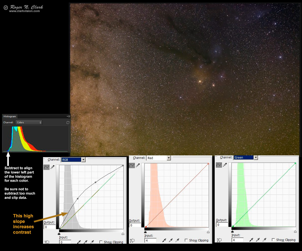
Figure 4b. Enhanced image from Figure 4a. Key aspects is the RGB
curve to brighten the image (line indicated by the burnt orange arrow),
and subtraction of 4 red units and 4 green units (none from blue).
The subtraction aligns the lower left point of the histogram of each
channel, indicated by the white arrow.
Next select regions of airglow gradient, feather the selection and
subtract as in Figure 4b. For example, these is a left to right gradient
from light pollution from the Denver metro area, with maximum light
pollution on the left. I made a selection aligned with the left edge
and top to bottom as shown in Figure 4c. The light pollution gradient
is embedded in the Milky Way brightness fall-off so removing light
pollution here is complex. I estimated the gradient is slow from left
to right so I feathered the selection by 999 in photoshop (Figure 4c).
Then I subtracted using curves as illustrated in Figure 4c.
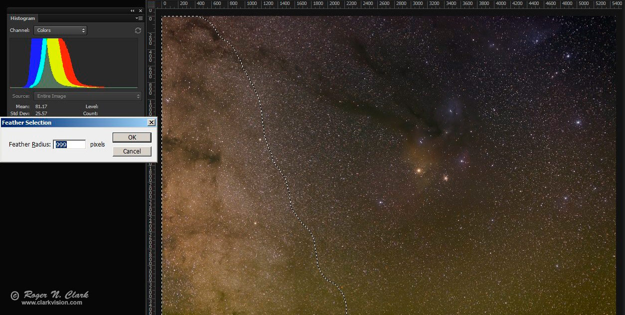
Figure 4c. A feathered selection selects a gradient. Note, the histogram
is of the selected region only.
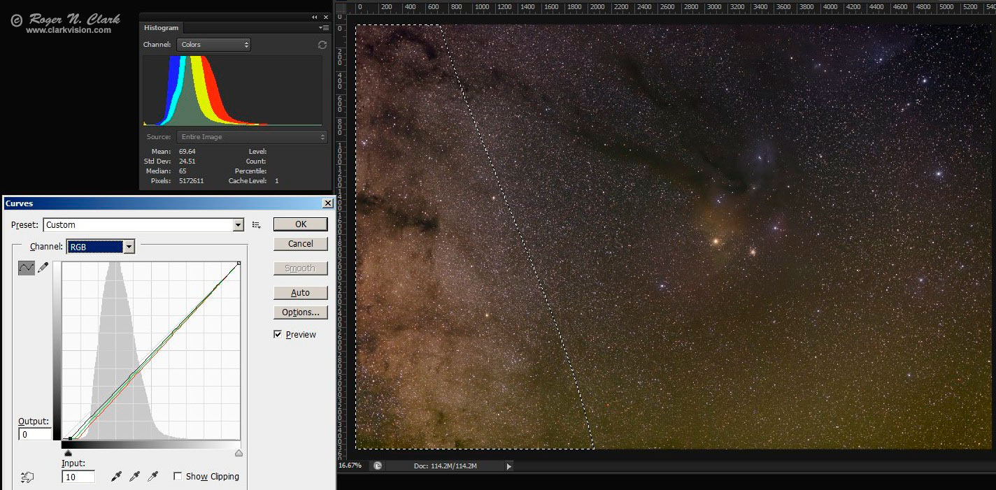
Figure 4d. Subtraction using the gradient defined in Figure 4c.
To reduce the light pollution gradient, 10 units was subtracted from the 3 RGB channels,
21 unites from red, 16 unites from green, and none from blue.
Note, the histogram is of the selected region only.
There is increasing airglow in the image from top to bottom (e.g. the
bottom looks green in Figure 4c and 4d, and that is airglow). As above, I
selected the airglow region, feathered it and subtracted it using curves.
The subtractions need not be perfect. It is better to not clip and
under correct than clip and lose information. One can always correct
more later. Curves work can be done in multiple iterations.
In subtracting light pollution, be careful not to subtract too much,
or change color channel relative levels such that colors in deep sky
objects are neutralized. For example, the full image histogram in
Figure 4a - 4d still shows the red peak at maximum, green in the middle
and blue lowest. The Milky way is reddish brown, so the histogram
should NOT be neutralized, so making the histogram peaks line up
should be avoided because the overall image should be reddish-brown.
Aligning the histogram peaks or right edges has unintended consequences
of reducing/warping other colors. For example, in other processing
methods I have seen, neutralizing the histogram peaks in a case like
this reduced the red channel, suppressing red nebulae (e.g. reducing
hydrogen-alpha response--this is discussed below and shown in Figure 9).
I made a couple of additional iterations similar to the above strategy which resulted in
the image in Figure 4e. The nebulae are starting to show quite nicely.
At this point, the faintest parts of the image are quite low (note the histogram
colors are aligned at the lower left in Figure 4e and close to the left edge.
At this point do not do any more subtractions as there is a danger of clipping
more data. Use the curves method shown in
Part 3a
for additional curves work.
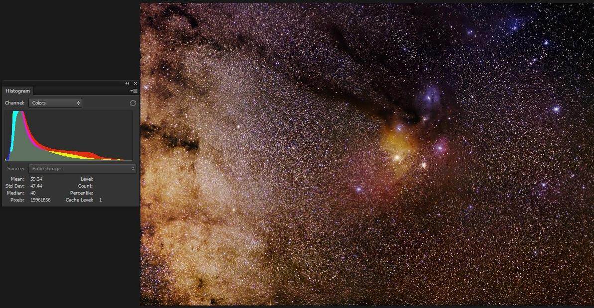
Figure 4e. Image after more curves work from from the image in Figure 4d.
Enhance
Next stretch and enhance the deep sky stars and nebulae with an iterative process by following the method
in Part 3a.
If after stretching, if more light pollution and airglow need might subtracting, just do
another curves run as described
in Part 3a.
Another step that works well in bringing out the nebulae in 4e is to do
some saturation enhancement.
For example, save the image in 4e and run saturation enhancement to see what improvements
you can do.
As a final step, I sharpened the image with Richardson-Lucy
image deconvolution using ImagesPlus with a 5x5 Gaussian profile, 8 iterations.
The image after all iterations of stretching and light pollution/airglow removal is shown in Figure 5a.
It is an exercise for the user to try multiple iterations to get to the results from Figure 4d to 5a.
Larger images are:
1/3 resolution
result (2 megabytes),
1/2 resolution
result (3.3 megabytes).
Figure 5a. Final image after raw conversion, stacking, curves work,
saturation enhancement, and Richardson-Lucy
image deconvolution.
Star Diameter Reduction
One side effect to larger stretches of astrophotos needed to bring out
faint detail is that lens flare is magnified making stars appear as
small disks, both saturated and unsaturated stars. Astrophoto image
processing software often includes star size reduction algorithms.
I used the star size reduction tool in ImagesPlus to make stars smaller
(Figure 5b). This has an interesting side effect: because stars are
smaller, nebula stand out more. This allows one to change what you
want to emphasize, stars or nebulae. I like the images in Figures 5a
and 5b for different reasons. Another side effect of the star reduction
algorithm seems to be a dark halo around stars in front of bright nebulae,
and that I do not like.
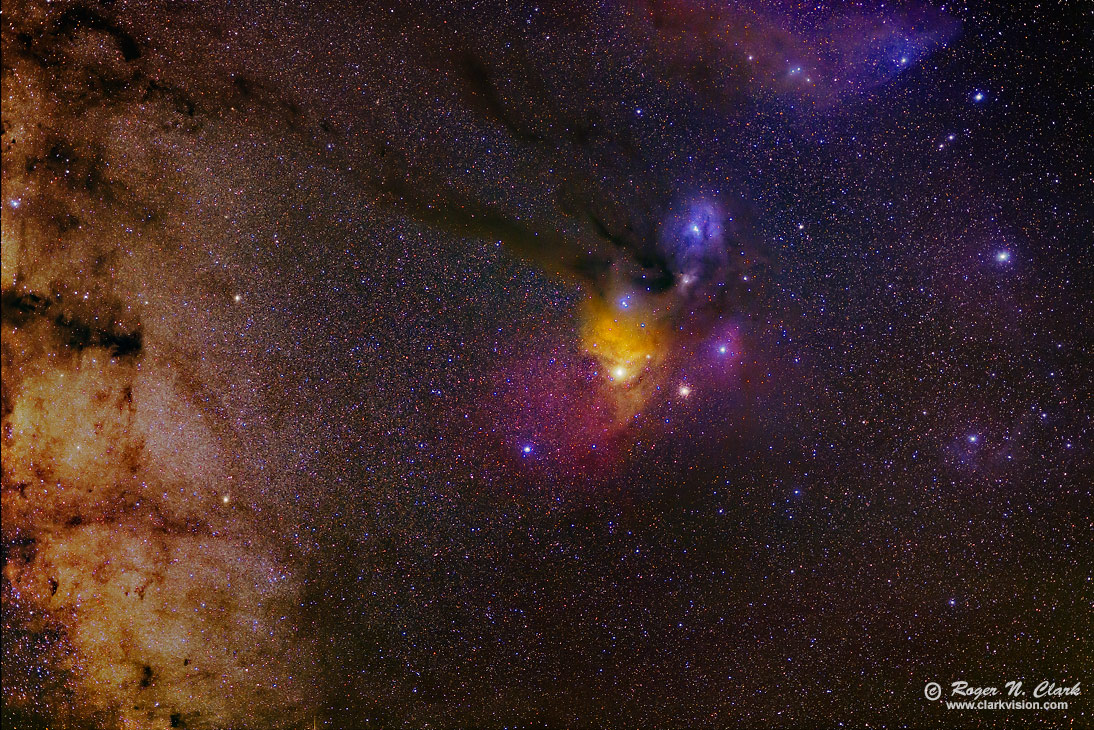
Figure 5b. The image from Figure 5a after applying the star size reduction tool in ImagesPlus twice
using the default settings.
Larger 1/2 resolution result (3.5 megabytes).
Is the Color Gradient Correct?
Well the internet is at it again. Many have tried my challenge below, but all too commonly
they end up with a bluing of the stars from left to right. Some insist that the changing
colors of stars to blue is real as one moves away from the galactic plane.
To test the true color I used the Tycho 2 Star catalog of over 2.4 million stars
down to past stellar magnitude 15 as described in
Part 2b) The Color of Stars
in this series.
I split the region of the image in Figure 5 into 4 zones with zone 1 being on the left side of the image, working
to the right and zone 4 is the right 1/4 of the image. I queried the Tycho data and plotted
the histograms of the star colors in each zone in Figure 6. Not only do the star catalog
data show that there is no bluing, notice zone 1 is highest in the blue and tends to be
lower in the red. I also made maps of star colors as a function of position using the Tycho 2 star
catalog data and the results are shown in Figure 7 of
Part 2b) The Color of Stars.
The star catalog data clearly show
that, not only is there no bluing, there is a
change to the red away from the galactic plane!
The conclusion is that if your processing is producing a bluing of the stars
away from the galactic plane, it is an artifact of your processing. It is not real.
This bluing seems to be at least partially responsible for reducing the red H-alpha
signatures in people's processing attempts.
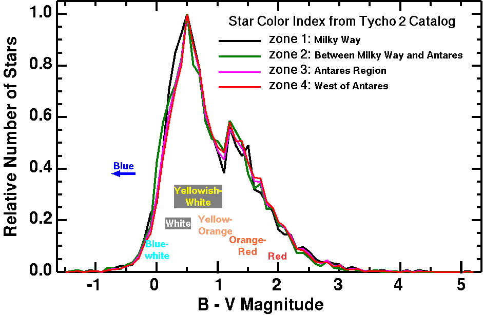
Figure 6. The histogram of star colors for 4 zones from the region of the image
in Figure 5. Zone 1 is the left quarter of the image region, zone 4 is the right
side. There is very little color change in the 4 zones. Note, there are relatively few
blue stars to begin with, and as one moves to from zone 1 to 4 out of the galactic plane,
there is actually a very small shift to the red.
Try it Yourself With These Images
People are using their own methods on the raw image files. For example,
here you can see results using other methods:
Reddit Astrophotography and
dpreview Astrophotography forum.
The original raw files are
here on dropbox. Try and see what image you can make.
If you do the challenge you give permission for me to post a small version of your image here
so I can discuss results.
About the Challenge
First, it is fine to criticize my image; I do not claim it to be perfect or the best thing out there.
I posted the image and this challenge to see if someone can show better ways to:
- 1) Take out the background airglow and light pollution,
- 2) Correct light fall-off,
- 3) Bring out faint nebulae of all kinds (yes including H-alpha),
- 4) Control noise and splotchiness while balancing that with sharpness,
- 5) Reduce aberrations, including chromatic aberrations.
If you do the challenge you give permission for me to post a small version of your image here
so I can discuss results.
People on the internet are pretty funny. One the one hand someone
says to image other H-alpha targets that are more challenging and on the
other hand they say the H-alpha in the challenge image is too faint.
I have even been accused of boosting the red channel to invent the
red H-alpha nebulae in the image. The traverse shown in Figure 7 shows
that the H-alpha nebula is clearly present in the data before any
enhancements were made to bring out the nebula. It is such a clear
signal, it is surprising that some have trouble making it visible.
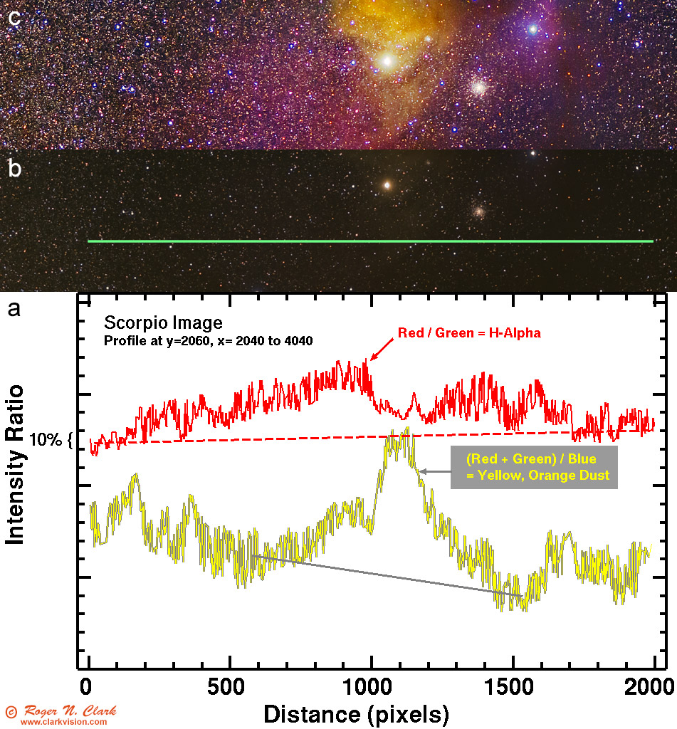
Figure 7. Traverse (a) of the image in Figure 4a across the H-alpha nebula on an image before
enhancement and gradient removal (traverse line in b). For reference, the enhanced portion of
Figure 5 is shown in (c) to illustrate the location of the H-alpha nebula. The red H-alpha
is indicated by the increase in the red/green intensity ratio (red line in (a). For comparison,
the (red + green)/blue indicates yellow dust. The traverse has had bright stars removed,
but faint stars are still present and responsible for most of the apparent noise in the traverse.
Then even funnier is how they point to other images made with CCDs,
modified DSLRs, larger optics and hours of exposure in their efforts
to criticize a simple 9-minutes of exposure with a little 100 mm f/2
lens. They are missing the whole point of the challenge. It is NOT to
produce the best ever Rho Ophiuchus region image. it is to show the best
processing results with whatever data one has.
I do not claim here that my processing of the challenge image is the
best and only way. It is a new way, a method that I have been doing
since about 2008. I don't claim it to be perfect, and I continually
refine it. But the method does have advantages which are discussed in
the other articles in this series. Of course, the specifics of how one
implements the various tools of any method can have both positive and
negative results regarding the final output.
Then it is even funnier that critics on the internet insist on many
things, like blue star gradients away from the galactic center. The
stellar photometry data show such a claim to be bogus. There are other
claims, including that one needs bias frames and scaling dark current.
But bias is a single value (2048 on the 14-bit camera raw data from
the Canon 6D), and the camera has on-sensor dark frame suppression.
Thus there is no need for bias frames, nor dark frames, regardless of
processing method. Including these just adds noise and that reduces
what faint signals can be extracted. That's a hint: do not use the
dark frames in your processing if you try the challenge, and use
a good modern raw converter. Figure 8 shows the difference in methods
and using dark frames. ImagesPlus uses a traditional raw conversion to
linear data similar to other astrophoto image processing systems. The image in Figure
8b has lower noise than the image in 8a if bad pixels are not included in the
statistics. Dark frame subtraction (8a) removes bad pixels in traditional
raw converters. Modern raw converters, like ACR (Figure 8c) use the
bad pixel list in the raw file to skip those pixels during raw conversion. ACR
also allows noise reduction at the raw conversion level (the amount of noise
reduction is completely selectable by the user, so if you believe the noise reduction
in Figure 8c is too much, simply choose a lower amount).
Trying to do noise reduction on the images in Figure 8a or 8b has a higher chance
of making a splotchy background due to the color noise (which I have seen in
attempts by some people in this challenge).
It is the lower noise as illustrated in Figure 8c that enables one to pull out more
faint detail. The noise reduction produces results similar to much longer
exposure times with traditional methods.
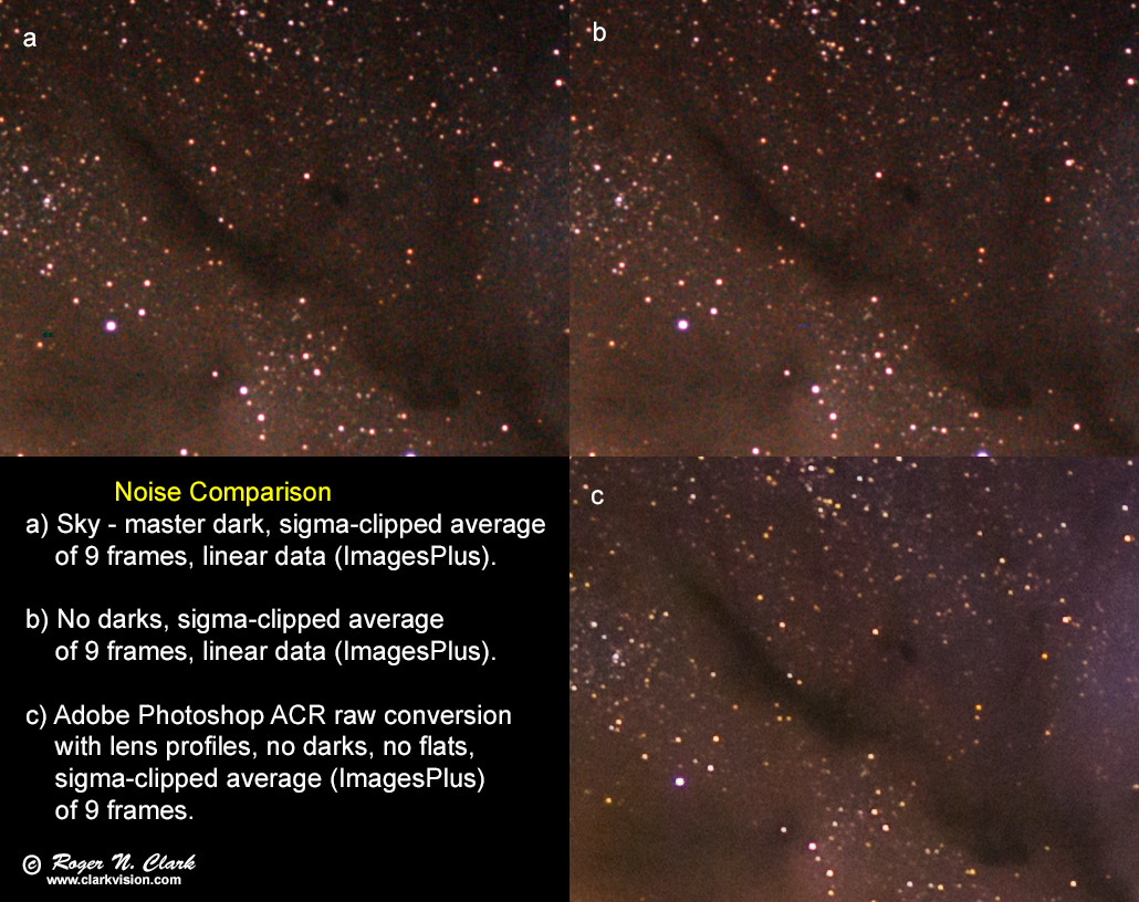
Figure 8. Three methods of raw conversion and dark frame subtraction or not are compared.
There is little difference between (a) and (b) because the camera has on sensor
dark current suppression. Both (a) and (b) were stretched the same to illustrate
noise, and (c) was stretched to have similar levels as (a) and (b) for comparison.
The images are at full resolution.
Note too which method(s) show more halos around stars.
Blue stars are popular. I really don't care if you want to manufacture
far more blue stars that exist in nature. It does make for more colorful
images and is certainly artistic license. But don't tell me I'm wrong if
I try to process for a more natural color balance. Most post processing
I have seen for this challenge so far has created a bluing color gradient
that is a post processing artifact (or intentional), and people should
know that these color gradients are impacting pulling out faint nebulae,
especially the red H-alpha. Of course the "internet experts" don't agree.
Fine--the photometric data does not support their claim that such blue
gradients are real. Why this is important is that by creating the blue
gradient, they are reducing red relative to blue and that suppresses
red H-alpha.
Diagnosing Problems Using Histograms
Histogram equalization can suppress colors. The results in Figure 9 show
different processing attempts. Which panels had histogram equalization,
or some form applied? Some are really obvious, like f. But it is not
just alignment. It is also shape. For example, two images, g, i have
each channel with the same shape, but the green channel is shifted. That
causes a color cast to magenta. Panel h is interesting because the red
channel histogram encompasses the blue channel histogram and green at
both the high and low ends. More can be discerned by selecting smaller
portions of an image and examining the histograms for each channel. That
can show regional histogram equalization, for example. Selecting just the
background in an area can show what was done there, including histogram
equalization. And this shows whether the image data are 16-bit tiff or
8-bit jpegs. The jpeg data might be a little noisier, but the trends
and diagnostics are clear.
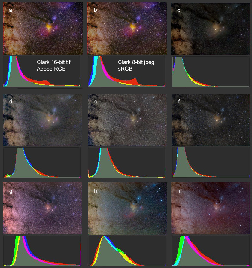
Figure 9. Results from different processing attempts.
Note that the 8-bit jpeg histogram (b) has the same basic shape as
(a). The main difference is the sRGB versus larger Adobe RGB color
space. Panels c to i show other processing attempts.
Which panels had histogram equalization,
of some form applied? See text.
The dominant color of the Milky Way, from the star color to red/brown
dust and hydrogen emission is red. Any histogram equalization in that
situation reduces red relative to blue. Thus, the weak red signals,
like that in the faint H-alpha nebula are pushed even weaker.
Astrophotographers can color their images any way they want. And changing
color balance to show a broader range of colors in a scene certainly makes
for a more interesting photo. But in applying algorithms, understand
the consequences. Histogram equalization that makes a red background
bluer reduces red. That means reducing the H-alpha response. The stellar
photometry data show that the gradient away from the galactic plane has a
greater number of red stars, not blue (see part 2b of this series: Color
of Stars). The faint star background in Milky Way photos would show
redder as one moves away from the plane of the galaxy for natural color.
Histogram equalization in the many examples to this challenge I see online
has created a blue gradient and many more blue stars (examples are
seen in Figure 9, panels c, d, e, f, and h; g and i too but the magenta
cast hides the blueing to some degree). It makes for a pretty picture,
but is not natural and has the side effect of suppressing red H-alpha.
The red peak in the histogram panels a and b in Figure 9, about 2/3 to the right,
is the light from the reddish Milky Way on the left side of the image. Panels
c-i have suppressed the red so the peak in the histogram is not seen.
All images that I have seen in response to this challenge, including
mine, could use more work. It is a tougher problem than it first seems,
but is representative of issues astrophotographers face when trying to
extract the faint info from an image regardless of the optics, cameras,
and exposure times. My point of the challenge is to find weaknesses in
any workflow and improve on them, including mine.
White Balance and Histogram Equalization
Following on the above discussion of histogram shape, it has become clear
that many astrophotographers at this time (2015) are performing
auto white balance of some form, including histogram equalization.
This is destroying natural color and often results in suppression of red
hydrogen-alpha emission.
To show the effect white balance methods have on images, I show the effects of different
processing in Figures 10a, 10b, and 10c. Clearly the auto color and
histogram equalization (Figures 10b, and 10c) have destroyed the beautiful
colors of the sunset. This will happen with ANY image that has a dominant
color--the dominant color is suppressed in order to enhance other colors.
Note that in Figures 10b, and 10c,
we see more blue. The auto white and histogram equalization suppresses
the dominant color and boosts weak colors. The histogram equalization in
Figures 10c has also enhanced green, making green clouds! Clearly these
colors are not real, nor did I see any such colors at the scene.
Histogram equalization and auto white balance should be avoided in
nightscape and astrophotography, and in my opinion, all photography
where you want natural colors.
See Figures 9a and 9b in
Aurora Photography
for the effects of auto white balance on aurora images.
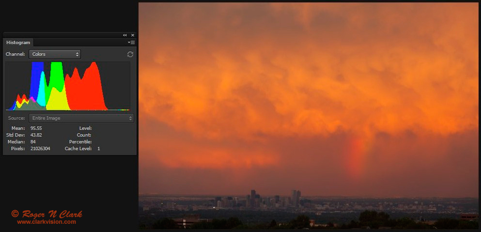
Figure 10a. Sunset with rainbow. This is how the scene appeared
to my eye. It was the rainbow and the intense red/orange colors
that drew me to take this photo in June 2010. The image was converted
from raw data using daylight white balance. This image looks essentially the
same as the out of camera jpeg.
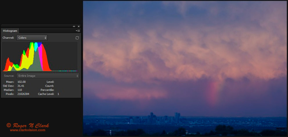
Figure 10b. Same image as in Figure 10a, but the raw conversion used auto
white balance in photoshop's ACR. Notice how the mean of the histogram of each color
line up.
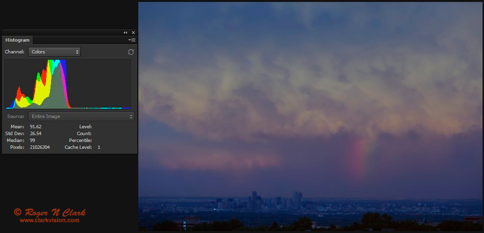
Figure 10c. Same image as in Figure 10b, but a histogram equalization step
was applied in photoshop (auto color). Notice how the
edges of histogram of each color line up. Another effect of
histogram equalization is a huge reduction in contrast.
Conclusions
Astrophotography image processing using modern raw converters and
simple image editors, primarily using the curves tool, can extract a
lot of information from images containing significant light pollution.
Specialized software is still needed to align and combine the multiple
exposures.
A number of people have taken the challenge and posted their results.
It has become clear that commonly applied processing methods used in
astrophotography suppress red and H-alpha in this image. The problem
seems to be application of a histogram equalization step in the processing
work flow. This is like auto white balance and if you applied such a
step to a red sunset image, the result would be a boring sunset with
little red.
The implications shown here are that image processing methods have a
lot to do with H-alpha response and in extracting faint signals from
the data. The Milky Way is actually dominantly yellowish to reddish,
so the auto white balance reduces that dominant red. Maybe the use of
modified cameras is not needed to the extent that people think!
If you find the information on this site useful,
please support Clarkvision and make a donation (link below).
References and Further Reading
Clarkvision.com Astrophoto Gallery.
Clarkvision.com Nightscapes Gallery.
The open source community is pretty active in the lens profile area. See:
Lensfun lens profiles:
http://lensfun.sourceforge.net/ All users can supply data.
Adobe released a lens profile creator:
http://www.adobe.com/support/downloads/detail.jsp?ftpID=5490
More discussions about lens profiles:
http://photo.stackexchange.com/questions/2229/is-the-format-for-the-distortion-and-chromatic-aberration-correction-of-%C2%B54-3-len
Compare to other Images of this scene
The Dark River to Antares Astronomy Picture of the Day by Jason Jennings.
http://apod.nasa.gov/apod/ap150222.html
H-alpha modified Canon 6D + 70 - 200 mm f/2.8, 36 minutes of exposure, ISO 1600, by Tony or Daphne Hallas:
http://www.astrophoto.com/RhoOphiuchus.htm
Dedicated CCD: Exposures: H-alpha: 5X24 minutes, RGB: 8X5 minutes each, 200 mm focal lens
at f/4, 160 minutes total exposure, by Michael A. Stecker:
http://mstecker.com/pages/astrho200mm-HRGB5smJRF.htm.
This image is 21 times the exposure from the subject compared to the 9-minute image above.
Canon 60da (that is an H-alpha astro modified camera), 70 mm focal length
lens at f/4, 51 minutes exposure, ISO 1600 by Jonathan Talbot:
http://www.starscapeimaging.com/page88/index.html.
Exposure relative to the 9-minute image above: 0.7x.
The Night Photography Series:
http://clarkvision.com/articles/astrophotography.image.processing
First Published July 6, 2015
Last updated Fenruary 28, 2016